Analysis

About Analysis

As a supervisor, you can use the Analysis application to plot historical and live charts to visualize time series data available in Plant Applications and Historian.

Analysis application displays information for production batches in the form of a Gantt chart.

It enables operators, supervisors, and process engineers to analyze time series data and live issues, and to quickly troubleshoot issues and make improvements. Process engineers can also analyze the production batches and golden batches information.

Analyze a Process Order

About This Task

You can use the Analysis application to analyze one or more Process Orders when Plant Applications is configured to use process orders instead of batches. In some organizations, a batch is identified as a process order number. In this scenario, the process order quantity is the batch quantity produced in a production run.

Procedure

  1. Log in to the Plant Applications Universal Client.
  2. Select .

    The Chart Configuration page appears.

  3. In the Plant Model list, select a plant model associated with the process order.
  4. In the Data type list, select Process Orders.
    Note: The Process Orders option appears only when the Plant Applications universal client is configured to use process orders instead of batches.
  5. Search for the process order that you want to analyze, and then, in the Process Orders section, select Add Process Orders.
    Tip: You can add multiple process orders to compare their details.
  6. Select Plot to access the CHART CONTROLS page, and then analyze the process order.
    Tip: Alternatively, you can select to access the CHART CONTROLS page.

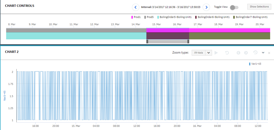
    By default, the CHART CONTROLS page appears in Normal View and a Gantt chart appears for the selected process order.

    If you selected only one process order, the process order available in the five days before and after the selected process order also appears in the chart. You can hover over a process order to view its details. For more information about trend charts, refer to the Types of Trend Charts topic.

    In the CHART CONTROLS page, you can use the Toggle View option to toggle between the interval and duration modes.

    If you selected multiple process orders, then the Gantt chart appears in the duration mode only.

  7. Analyze the selected process order with respect to variables in a Line chart by following these steps:
    1. Select to go back to the Chart Configuration page.
    2. In the Data type list, select Variables.
    3. Search for the variables you want to plot in the Line chart, then select Add Chart, and then select Plot to plot the selected variables for the selected process order in a single Line chart.
      Tip: Select Add Chart to add more charts and plot a single variable or a combination of variables in different charts.

    In the CHART CONTROLS page, the Line chart appears in the CHART 2 section after the Gantt chart as shown in the following image.

    You can set the time slider bar for the required time duration for the process order. When you update the time duration for the process order in the Gantt chart, the application updates the corresponding Line chart displaying the time series data. In addition, the application synchronizes the horizontal axis for the Gantt and Line charts.

Analyze a Batch

You can use the Analysis application to analyze a batch, compare the batch with the other batches, navigate to previous and next batches, and compare how the variables associated with the batch produced trend over the batch duration. The ANSI/ISA???88.01???1995 documentation defines a batch as the material that is being produced or that has been produced by a single execution of a batch process or an entity that represents the production of a material at any point in the process. Batches are produced on a single equipment or a process cell. A golden batch is a batch that is identified to be used as a reference batch for a few specific KPIs such as the best yield, lowest waste, best quality, and higher productivity.

Procedure

  1. Log in to the Plant Applications Universal Client.
  2. Select .

    The Chart Configuration page appears.

  3. In the Plant Model list, select a plant model associated with the batch.
  4. In the Data type list, select Batches.
    Note: The Batches and Golden Batches options appear only when the Plant Applications universal client is configured to use batches instead of process orders.
  5. Search for the batch that you want to analyze, and then, in the Batches section, select Add Batches.
    Tip: You can add multiple normal batches or golden batches to compare their details. For more information, refer to the Add Tags, Variables, KPIs, Process Orders, and Batches topic.
  6. Select Plot to access the CHART CONTROLS page, and then analyze the batch.
    Tip: Alternatively, you can select to access the CHART CONTROLS page.

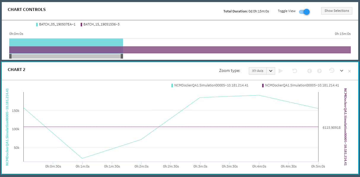
    By default, the CHART CONTROLS page appears in Normal View, displaying a Gantt chart for the selected batch. If you selected only one batch, the batches available within the five days before and after the selected batch also appears in the chart. You can hover over a batch to view its details. For more information about trend charts, refer to the Types of Trend Charts topic.

    In the CHART CONTROLS page, you can use the Toggle View option to toggle between the interval and duration modes.

  7. Analyze the selected batch with respect to variables in a Line chart by following these steps:
    1. Select to return to the Chart Configuration page.
    2. In the Data type list, select Variables.
    3. Search for the variables you want to plot in the Line chart, then select Add Chart, and then select Plot to plot the selected variables for the selected batch in a single Line chart.
      Tip: Select Add Chart to add more charts and plot a single variable or a combination of variables in different charts.

    In the CHART CONTROLS page, the Line chart appears in the CHART 2 section after the Gantt chart as shown in the following image.

    You can set the time slider bar for the required time duration for the process order. When you update the time duration for the process order in the Gantt chart, the application updates the corresponding Line chart displaying the time series data. In addition, the application synchronizes the horizontal axis for the Gantt and Line charts.

Add Tags, Variables, KPIs, Process Orders, and Batches

You can add Historian tags, Plant Applications variables, KPIs, process orders, batches, and golden batches to the Analysis page to trend required charts and display tables for analyzing information.

Procedure

  1. Log in to the Plant Applications Universal Client.
  2. Select .

    The Chart Configuration page appears. By default, the Tags option appears in the Data type list.

  3. Select a context in the Plant Model list.
    Note: You must expand the plant name to navigate and select the required department, line, or unit of your plant. The selected department, line, or unit appears for the plant model in the Plant Model list.
  4. Select the required Historian server in the Historians list.
    Note: The Historians list appears only when you select Tags in the Data type list. You can plot the Historian tags belonging to multiple Historian servers, limited to 10 servers only. The Historian server can be local or remote. A local Historian server is installed on the same node as the Process Analyzer. The remote Historian server is installed on a node different than that of the Process Analyzer. The minimum supported version is Historian 7.0 SP5 or later.
  5. In the Data type list, select one of the following options:
    • Tags
    • Variables
    • KPI (available for lines and units only)
    • Process Orders (available only if the Plant Applications universal client is configured to use process orders)
    • Batches (available only if the Plant Applications universal client is configured to use batches)
    • Golden Batches (available only if the Plant Applications universal client is configured to use batches)
    Tip: To sort the search results, select a column name. To filter the data, select . For more information, refer to the topic Filter Tags, Variables, KPIs, Process Orders, and Batches.
  6. Depending on the data type, select one of the following options as shown in the following table.
    Data TypeOption
    VariablesAdd Chart
    KPIsAdd Chart
    VariablesAdd Chart
    BatchesAdd Batches
    Golden BatchesAdd Batches
    Process OrdersAdd Process Orders
    You can select multiple items.
    Note: To add multiple items to an existing chart, select Add Data for the chart. Alternatively, to add a new chart, drag the required items to the Add Chart button. GE recommends that you should restrict the total count of tags or variables for Live charts to five to optimize the trend chart output.
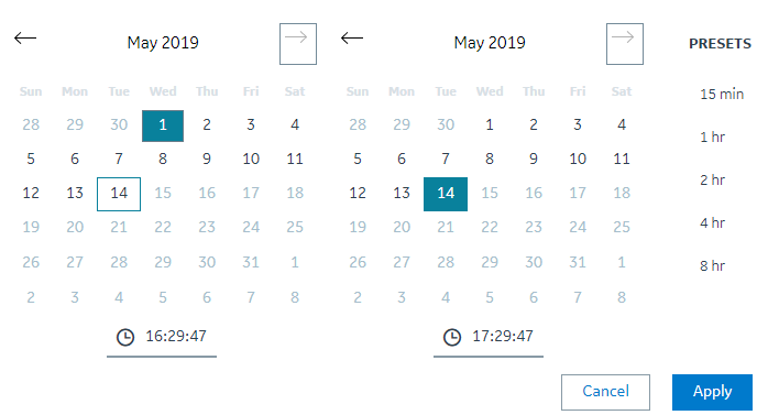
  7. Select to select an interval from the available Presets or to select a custom time interval by selecting the required dates and time, and then select Apply.

    The default time duration selected is the current time minus one hour. If you select an interval from the calendar, the chart is enabled to be plotted as the Historical chart instead of the Live chart.

  8. After you add the required items to the charts, select Plot.
    With larger data samples the loading time of the analysis session may increase.
    A live chart is plotted on the screen as Chart 1.

Results

The Analysis page appears, displaying the required trend charts and information.
Tip: You can select to open the Chart Configuration page to search and add more tags, variables, KPIs, batches, or process orders for analysis. In the Chart Configuration page, you can select to open the Analysis page.

You can further save an analysis trend to restore the analysis view. The trends you save are accessible by all users. For more information, refer to the Save an Analysis Trend topic.

Filter Tags, Variables, KPIs, Process Orders, and Batches

Procedure

  1. Log in to the Plant Applications Universal Client.
  2. Select .

    The Chart Configuration page appears as shown in the following image. By default, the Tags option appears in the Data type list.

  3. Select a context in the Plant Model list.
    Note: You must expand the plant name to navigate and select the required department, line, or unit of your plant. The selected department, line, or unit appears for the plant model in the Plant Model list.
  4. Select the required Historian server in the Historians list.
  5. In the Data type list, select one of the following options:
    • Tags
    • Variables
    • KPI (available for lines and units only)
    • Process Orders (available only if the Plant Applications universal client is configured to use process orders)
    • Batches (available only if the Plant Applications universal client is configured to use batches)
    • Golden Batches (available only if the Plant Applications universal client is configured to use batches)
  6. Select to filter the required data.
    The filter window appears based on the selected Data type.

Results

The data is filtered per your selections.

Access Trend Charts

About This Task

When you select tags, variables, or KPIs and add the data for analysis, your selections are added to a Live chart instance in the Analysis application.
Note: The following features are currently not available for live charts:
  • Print preview and print
  • Export
  • Filter
  • Zoom
  • Range for y-axis
  • Multifield and string tags
You cannot modify the live charts. The chart is autorefreshed with the x-axis duration set to 60 minutes.
Note: You can change the Sampling Mode of Trend Charts by changing the value of samplinMode property in app.properties.json file at C:\Program Files\GE Digital\PlantApplicationsUniversalClient\NodeUIApp\process-analyzer-app\assets. By default, the value is set to Interpolated. The interpolated values are displayed on the chart. Another permissible value of samplingMode property is Trend,in that selection all the sample count values are displayed.

Procedure

  • In the Analysis page, select to access the historical chart for a live chart.
    Note: Live mode is not supported when the batches with specific times are displayed along with Tags, Variables, and KPIs. You must edit the chart and select Use Time to reset before you switch to Live mode. For more information, refer to the Modify Charts topic.
  • Select for a chart to access a menu containing Chart Info and to Show Statistics options.
    • Select Chart Info to access the Chart Type, Start and End date and time, and Tags information.
    • Select Show Statistics to access the Name of the trended tags, First Raw Value, Last Raw Value, Minimum Value, Maximum Value, Count, Raw Total, Raw Average, and Raw Standard Deviation.
    • Select Remove Chart or select to delete the respective chart.
    If you add more than two tags, variables, or KPIs to a chart for analysis, a common y-axis appears in the chart. The y-axis is automatically scaled based on the minimum and maximum values of all the individual y-axes.
  • Optional: To rename a chart, select the title, and then enter the new name.
  • Optional: Select to zoom backwards, or select to zoom forward for the saved zooms in a session.
    In a Historical chart, you can drag and select a time frame to analyze. You can zoom forward multiple times. The forward and backward zooms are saved for a session or until the zoom is reset. For example, if the trend chart represents a longer time frame of one month, you can zoom in to a shorter time frame for a week, and further zoom in to specific hours or minutes of a day to analyze the trend data.
    Note: When no data is available for a time window, or if the time window spans less than one second, you may not see any information.
    Select to reset the zoom to default.
    You can also select one of the following options in the Zoom type list to refine your selection:
    • XY-Axis: To zoom both x- and y-axes in the Historical chart.
    • X-Axis: To zoom only x-axis in the Historical chart.
    • Y-Axis: To zoom only y-axis in the Historical chart.
  • Optional: Use one of the following layout options.
    Layout OptionsDescription
    Multi-select modeSelects multiple trend charts or events from the session. After selecting the required trend charts and events you can perform the following actions:
    • After you select multi-select mode, you can select to view one or two trend charts in full-screen mode. You can select to exit full-screen mode.
    • You can clear the Multi-select mode check box to return to the default mode.

    You cannot modify the charts in multi-select mode.

    Normal ViewDisplays the default view.
    Column ViewDisplays the trend charts and batches information in two columns.
    Stacked ViewDisplays the trend charts and batches information as stacked rows.
    (Show / Hide Chart controls)Enables the following behaviors:
    • When the chart controls for the batches are not available, the chart controls are disabled.
    • When the chart controls for the batches appear, you can select the icon to hide chart controls.
    • When the chart controls for the batches are hidden, you can select the icon to show chart controls.
    (Export Trended Data)Downloads trended data (both good and bad qualities data) as a .csv file.
    Note: When the chart appears blank; that is, the plotted variable has no data, if you export trended data, dummy data of the type bad quality appears in the .csv file.
    (Export Raw Data)Downloads raw data (only good quality data) as a .csv file.
    Note: When the chart appears blank; that is, the plotted variable has no data, if you export raw data, dummy data of the type bad quality appears in the .csv file.
    (Preview Page)Previews available trend charts for printing. You can select the Print Page button to print the charts.
    (Full screen)Displays the selected charts in full-screen mode. Select to exit full-screen mode.
    Note: You cannot use the keyboard shortcuts like F11 (to run in full-screen mode) or Esc (to exist full-screen mode).
    (Clear Analysis)Deletes the trend charts and event information from the current session.
  • Modify Charts

    You can modify the type, color, and scale of a displayed chart.

    Procedure

    1. Select next to the tag name to access the editing menu for the respective trend.
      Note: You can enable or disable a trend on a chart by clicking on the respective tag name.
    2. Optional: Select Edit to modify the following chart elements, and then select OK to apply the changes.
      SelectOptions
      Type
      • Line
      • Line Smoothed
      • Area
      • Area Smoothed
      • Scatter
      For more information about chart types, refer to the Types of Trend Charts topic.
      ColorSelect a color for the trend chart.
      Auto ScaleBy default, Auto Scale is enabled. You can disable the default settings and provide your own range for the scale by providing Min and Max values.
      Use TimeBy default, Use Time is enabled, which means that the tag or variable uses the current time. You can disable the time and select the required date and time interval you want to analyze for the corresponding tag or variable.
    3. Optional: Select the Switch Y-Axis option to switch the y-axis for the corresponding tag or variable.
    4. Optional: You can show and hide rejection limits for the Plant Applications variables by using Show Spec Limits and Hide Spec Limits respectively. If the variable exceeds the rejection limits (L Rej, U Rej), the product is rejected.
      Note: You can only display specification limits for Plant Applications variables. By default, the variable specifications limits do not appear in the chart.
    5. Select Remove to remove a chart or variable from a trend chart.

    Types of Trend Charts

    Trend charts are graphical representations for showing how the value of one or more items changes over time.

    Trend charts can display information as Line, Area, and Scatter charts.
    Figure: Line Chart

    Line is the default type of chart.

    Figure: Line Smoothed Chart
    Figure: Area Chart
    Figure: Area Smoothed Chart
    Figure: Scatter Chart

    Save an Analysis Trend

    Procedure

    1. Log in to the Plant Applications Universal Client.
    2. Select .

      The Chart Configuration page appears.

    3. Select a plant model and data type for which you want to view the trend chart.
    4. Depending on the data type, select Add Chart or Add Batches, and then select Plot.
    5. Select .
      The Save Trends window appears.
    6. In the Title box, enter a descriptive name for the chart.
    7. Select Save.
      The current analysis view is saved as an analysis trend and is accessible by all users.
      Tip: To restore or delete the saved trend, select in the Chart Configuration page. For more information, refer to the Restore a Saved Trend and Delete a Saved Trend topics.

    Restore a Saved Trend

    Procedure

    1. Log in to the Plant Applications Universal Client.
    2. Select .

      The Chart Configuration page appears.

    3. Select .
      The Restore Trends window appears.
    4. In the saved trends list, select the trend that you want to restore.
    5. Select Restore.
      The saved trend is restored as an analysis view.

    Delete a Saved Trend

    Procedure

    1. Log in to the Plant Applications Universal Client.
    2. Select .

      The Chart Configuration page appears.

    3. Select .
      The Restore Trends window appears.
    4. In the saved trends list, select the trend that you want to delete.
    5. Select Delete.
      The Delete Trend window appears, asking you to confirm that you want to delete the selected trend.
    6. Select Yes.
      The saved trend is deleted and is no longer accessible to any users.