Dashboard Widgets
About Dashboard Widgets
The content of a dashboard is displayed in various widgets on the Dashboard page. The number of widgets displayed on the page and their content depends on information defined by the user who last saved the dashboard.
Each dashboard widget has:
- A read-only view, which is displayed to all users that are members of the appropriate module-level Security Groups.
- The Edit Widget window, which can be accessed only by users that have Edit permissions to the Catalog folders that store a dashboard. In order for these users to make changes to the dashboard widget via the Edit Widget window, they must be members of the appropriate module-level Security Groups.
Throughout this documentation, we use the term dashboard widget or widget to refer to the read-only view of a widget.
The following widget types are available:
About User Display Preferences
The term user display preferences refers to the way that a dashboard looks when you complete one or more of the following tasks:
- Hide or display a dashboard widget.
- Modify the size of a dashboard widget.
- Arrange dashboard widgets.
Your user display preferences are retained when another user does either of the following:
When another user removes a widget from the dashboard for which you have specified display preferences, your display preferences will be retained; however the widget that was removed will no longer be displayed.
About Hyperlink Widgets
A Hyperlink dashboard widget displays a list of hyperlinks, as specified by the user. The following image shows an example of a Hyperlink widget that has been configured for a dashboard.
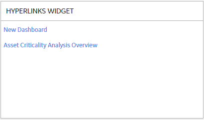
Hyperlink widgets support both internal and external GE Digital APM URL syntax.
Edit Widget Window
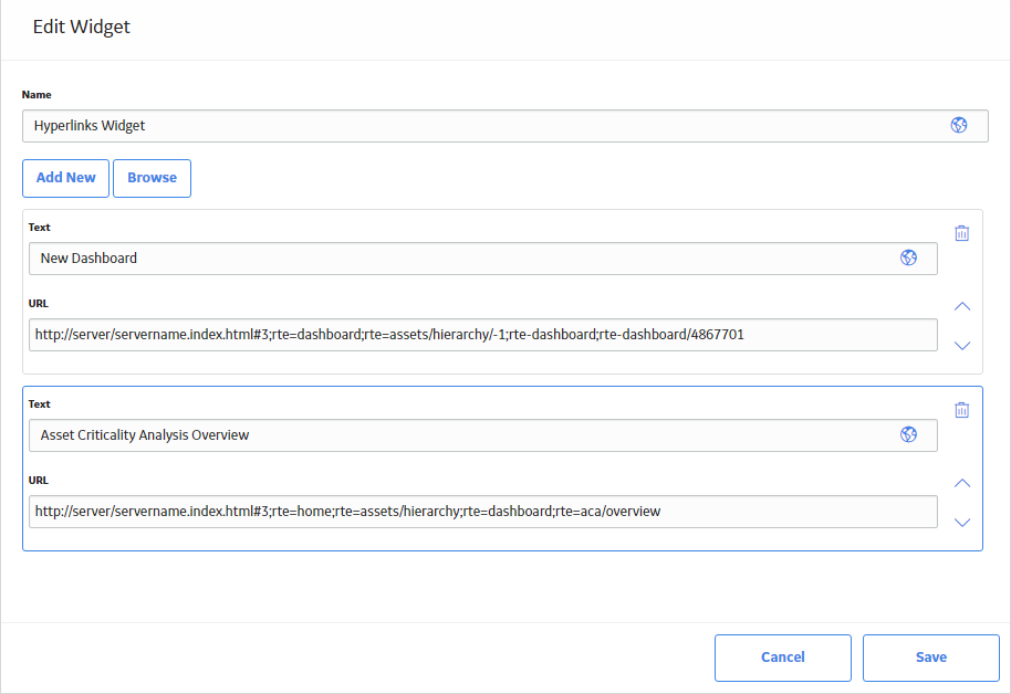
The Edit Widget window for a Hyperlink widget provides options that are used to configure the content that is displayed on a Hyperlink widget. The Edit Widget window contains the following fields:
-
Name: Specifies the label for the widget. You can select
 to specify localized values for the widget label.
 -
Text: Specifies the hyperlink label that will appear on
the widget. You can select
 to specify localized values for the widget label.
 - URL: Specifies the URL that you want to use.
-
 : Deletes the selected hyperlink from the widget.
 -
 and
and  : Used to move the selected item up or down in the list of hyperlinks.
About Query Widgets
A Query dashboard widget displays query results, as specified by the user. The following image shows an example of a Query widget that has been configured for a dashboard.
Edit Widget Window
The Edit Widget window for a Query widget provides options that are used to configure the content displayed on a Query widget. The Edit Widget window contains the following items:
-
Name
: Specifies the label for the widget. You can select
 to specify localized values for the widget label.
 -
Path: Specifies the Catalog location of the query whose results are displayed on the widget. You can select
 to select a query from the Catalog.
About Graph Widgets
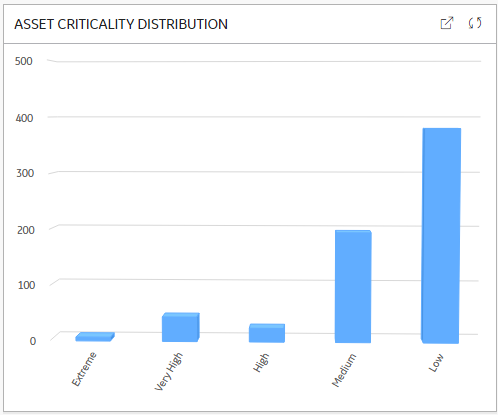
A Graph dashboard widget displays a graphical representation of query results, as specified by the user. The following image shows an example of a Graph widget that has been configured for a dashboard.
Edit Widget Window
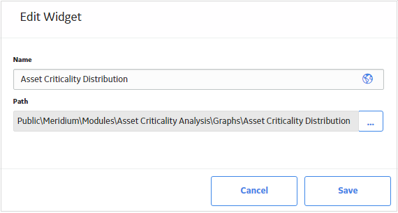
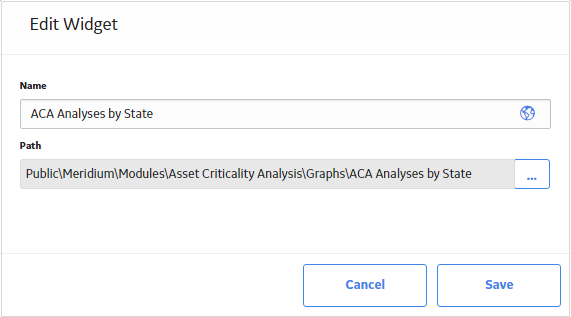
The Edit Widget window for a Graph widget provides options that are used to configure the content that is displayed on a Graph widget. The Edit Widget window contains the following fields:
-
Name: Specifies the label for the widget. You can select
 to specify localized values for the widget label.
 -
Path: Specifies the Catalog location of the path whose results are displayed on the widget. You can select
 to select a query from the Catalog.
About KPI Widgets
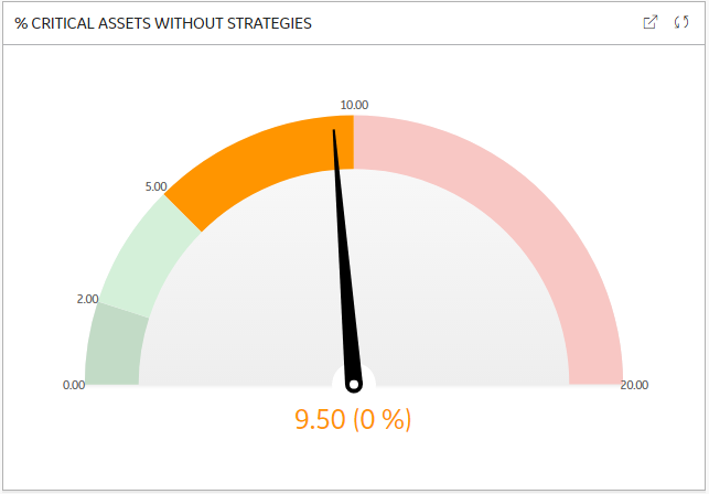
A KPI dashboard widget displays Key Performance Indicators, as specified by the user. You can choose to display Key Performance Indicators either as a dial or as a bullet chart. The following image shows an example of a KPI dial widget that has been configured for a dashboard.
The following image shows an example of a KPI bullet chart widget configured for a dashboard.

Edit Widget Window
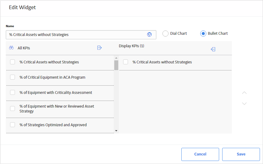
The Edit Widget window for a KPI widget provides options that are used to configure the content that is displayed on a KPI widget. The Edit Widget window contains the following fields:
-
Name: Specifies the label for the widget. You can select
 to specify localized values for the widget label.
 -
All KPIs section: Displays the potential KPIs that could be displayed on the widget. You can select
 to search for a specific KPI.
 - Display KPIs section: Displays the KPIs selected to be displayed on the widget.
-
 and
and : Moves selected KPIs between the All KPIs and Display KPIs section.
About Image Widgets
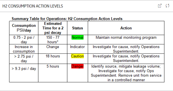
An Image dashboard widget displays a custom image, as specified by the user. The following image shows an example of an Image widget that has been configured for a dashboard.
Edit Widget Window
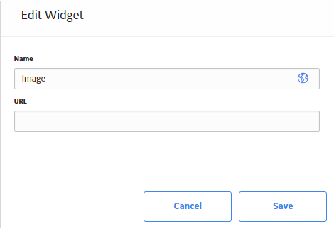
The Edit Widget window for an Image widget provides options that are used to configure the content that is displayed on an Image widget. The Edit Widget window contains the following fields:
-
Name: Specifies the label for the widget. You can select
 to specify localized values for the widget label.
 -
URL: Displays the URL where the custom image is located. The types of image file supported depend on the type of web browser used with your particular instance of GE Digital APM.
About Calendar Widgets
A Calendar dashboard widget displays a list of events based on a query for a specific time period. The following image shows an example of a Calendar widget that has been configured for a dashboard. At any point in time, the events displayed on the calendar widget are for a particular day.
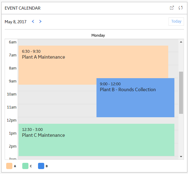
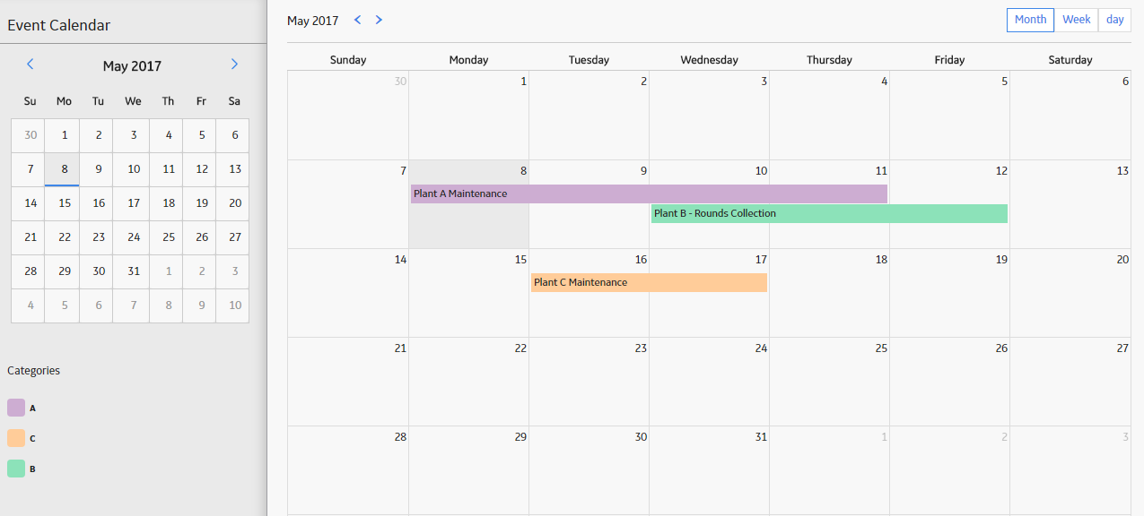
If you select  , the widget will expand into a larger view, as seen in the following image. To modify the display, you can select the Month, Week, or Day button.
Edit Widget Window
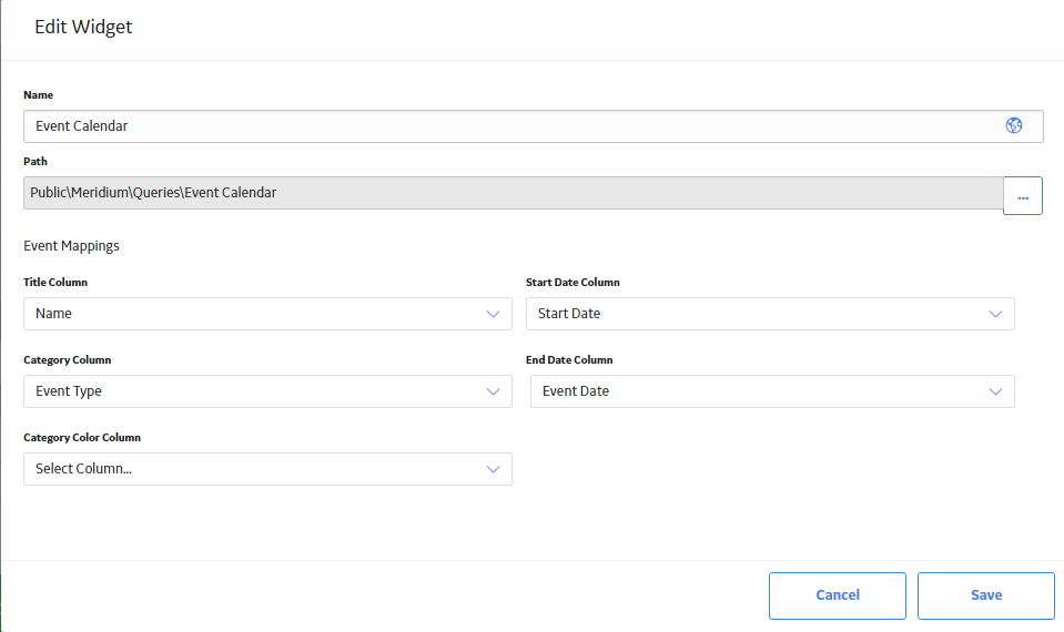
The Edit Widget window for a Calendar widget provides options that are used to configure the content that is displayed on a Calendar widget. The Edit Widget window contains the following fields:
-
Name: Specifies the label for the widget. You can select
 to specify localized values for the widget label.
 -
Path: Specifies the Catalog location of the query whose results are displayed on the widget. You can select
 to select a query from the Catalog.
 -
Event Mappings
section: Specifies how the columns in the specified query correspond to the values required by the Calendar widget. This section contains the following fields, each of which contain a list of the fields that are defined in the query:
- Title Column: The query column whose value will be displayed as the title of the calendar event. If the query column is defined as a hyperlink, then, in the Calendar widget, you can select the event to navigate to the defined location.
- Start Date Column: The query column whose value will be displayed as the start date of the calendar event.
- End Date Column: The query column whose value will be displayed as the end date and time of the calendar event. If there is no value for end date, then the event end time will be set to 15 minutes.
- Category Column: The query column whose value will be displayed as the event category for the calendar event. You can use the values in this column to filter the calendar events on the Calendar page.
- Category Color Column: The query column whose value will be displayed as the color for the calendar event. Each category has a predefined color. If no color is specified in the query, then the default colors will be displayed.
 .
.  , and then select