Operations Hub
Variwide Chart
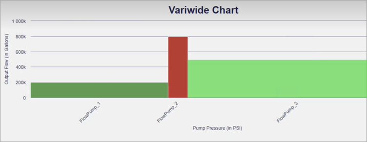
A variwide chart is a column chart where each column has a separate width to represent the third dimension.
The variwide chart is available under . When designing application pages, drag-and-drop GEVariwideChart to a container.
The following list of properties are specific to this widget. For common properties, refer to Page Components.
| Property | Description |
|---|---|
| Title Configuration | Set a title for your variwide chart.
|
| Label Configuration | Configure the axes labels in your variwide chart.
|
| Series Configuration | Select query output values from a data source to define a data series
for your chart. Only three inputs from the query are considered for
mapping in the following order:
|
| Series color configuration - manual | Add items to configure colors in your chart. Use this property to
override the default chart series color.
If you configure both label and color, the column with the label name always appears in the specified color. If you configure only color, the color is applied to a column in a sequential order. Columns with no color configuration adopt the default highcharts configuration. |
Variwide Chart at Runtime
In the illustrated example, pump pressure is represented by the width of each column for the respective category.