Operations Hub
Spider Chart
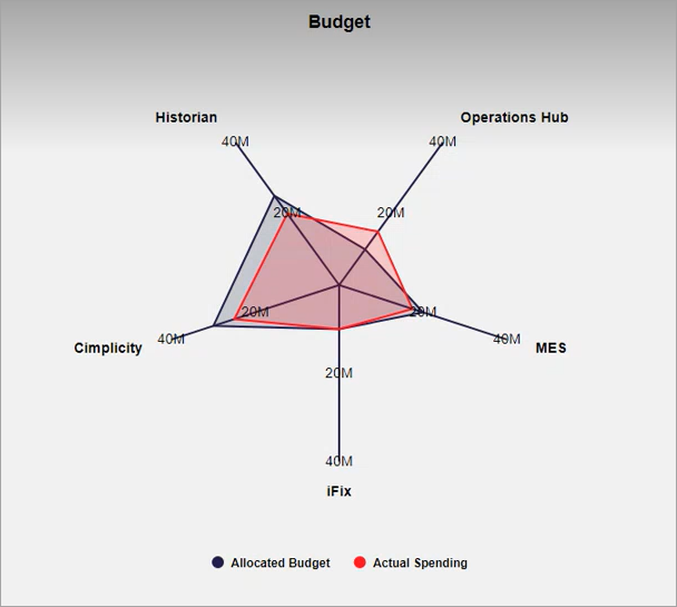
Use spider charts to compare and analyze multiple data sets.
With the spider chart widget, you can:
- Create visually appealing spider graphs.
- Apply unique color coding for efficient comparison of data.
- Analyze values that change over a period of time.
- Use the resultant information for better decision-making.
The spider chart is available under . When designing application pages, drag-and-drop GESpiderChart to a container.
The following list of properties are specific to this widget. For common properties, refer to Page Components.
| Property | Description |
|---|---|
| Title | Enter a title name for the spider chart. The title appears at runtime. |
| Font Color | Select a font color for the spider chart text. |
| Line Color | Select a line color for the spider chart axes. |
| Default Min | Enter the minimum axis value.
|
| Default Max | Enter the maximum axis value.
|
| Legend | Select:
|
| Max-width | Enter the maximum width the spider chart can occupy in an application. |
| Axis Labels | Add items to create multiple axes in a spider chart. Enter the following
information for each item (axis):
|
| Series | Add items to set up a data series for the spider chart.
|
Spider Chart at Runtime