 Operations Hub
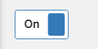
Toggle
The widget is available under . When designing application pages, drag-and-drop toggle to a container. To use the old version, refer to Toggle.
| Property | Description |
|---|---|
| Label | A lable name that appears as a header for the toggle. |
| True State | The text that appears when the toggle is in true state. For example,
On. |
| False State | The text that appears when the toggle is in false state. For example,
Off. |
| Target > Output Value | Provide the target data source to send information. |
| Source > Input Value | Provide the input data source to receive values for the toggle. |
| Label Styling | Formats the toggle text: Font Family, Font Size, and Font Color formats the label text and true/false state text. |
| Toggle Width | Enter a width for the toggle. |