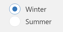
Radio Button
The widget is available under . When designing application pages, drag-and-drop radio to a container. To use the old version, refer to Radio Button.
| Property | Description |
|---|---|
| Label | A lable name that appears as a header for the radio button. |
| Target > Output Value | Provide the target data source to send information. |
| Source > Input Value | Provide the input data source to receive values for the radio button. |
| Items | Radio button requires multiple options. Select +Add Item to add multiple options. For each item, specify a display text and value. |
| Label Styling | Formats the label: Font Family, Font Size, and Font Color formats the label text. Background Color adds a color to the label background. |
