
 Operations Hub
Pivot Grid
Pivot grid allows to visualize data in a multi-dimensional format.
- Rename rows/columns to replace lengthy tag names
- Apply conditional formatting to rows/columns based on values
- Calculate values quickly using totals
- Sort, filter, and summarize data
- Export pivot data to Excel
The pivot grid is available under . When designing application pages, drag-and-drop GEPivotGrid to a container.
The following list of properties are specific to this widget. For common properties, refer to Page Components.
| Property | Description |
|---|---|
| Source - Input | To enable the pivot grid, provide values from a data source.
|
| Height (px) - 0 equals dynamic | Set a height for the pivot grid in pixels. If set to 0, the widget occupies 100% of its container. |
| Row Header Width (px) - 0 equals dynamic | Set a width for the header row in pixels. |
| Show Borders | Select the check box to apply a border to the pivot grid table. To remove the border, clear the check box. |
| Allow Sorting | Select the check box to sort the rows and columns alphabetically by default. |
| Allow Sorting by Summary | Select the check box to provide an option to sort the rows by
column. At runtime, right-click the column you want to sort by and select the sorting option. |
| Allow Filtering Row/Column Values | Select the check box to provide an option to filter data at runtime. |
| Allow Expand/Collapse All | Select the check box to enable expand/collapse data levels at
runtime. Your pivot grid should have multiple data levels to use this property. For value-based table cell data, you can expand and collapse data details to aggregate values. |
| Allow Export | Select the check box to allow exporting data at runtime. |
| Show Row Totals | Select the check box to show totals for each row. |
| Show Row Grand Totals | Select the check box to show the grand totals for each row. |
| Show Column Totals | Select the check box to show totals for each column. |
| Show Column Grand Totals | Select the check box to show the grand totals for each column. |
| Field Configuration | Configure pivot grid rows, columns, and data. Map all the three
areas (rows, columns, data).
|
| Formatting: Set default colors for the pivot grid. | |
| Cell Color | Select a color for the pivot grid table cells. |
| Cell Font Color | Select a font color for the pivot grid table cell text. |
| Column Header Font Color | Select a font color for the pivot grid table column header text. This helps to differentiate the header text from the cell text. |
| Totals Background Color | Select a unique cell color for the row/column totals. |
| Totals Font Color | Select a font color for the row/column totals text. |
| Item Configuration: Allows to customize the pivot grid table to override the default settings. Select +Add Item for configuring options. | |
| Item Display |
|
| Conditional Formatting | Apply conditions to format cells based on values. You can create
more than one condition for a Row/Column
Value. The conditions are applied according to their
order of display. If more than one rule matches a particular cell,
the first condition in the list to match takes effect and rule
processing for that cell will stop. Select +Add
Item for options to create conditions. For
example, format a cell if its value is less than 9000:
Tip: If you want to format a row/column with a
color that does not change based on value, apply the
Always comparison
operator. |
Pivot Grid at Runtime
 to export the data to an Excel file.
 to show the Field Chooser
option.
to show the Field Chooser
option.- You can switch the position of row and column fields. To switch a field position, drag and drop the field in the desired row/column.
- You can apply multiple filters to the data to get focused results.
- You can sort fields by ascending/descending order.
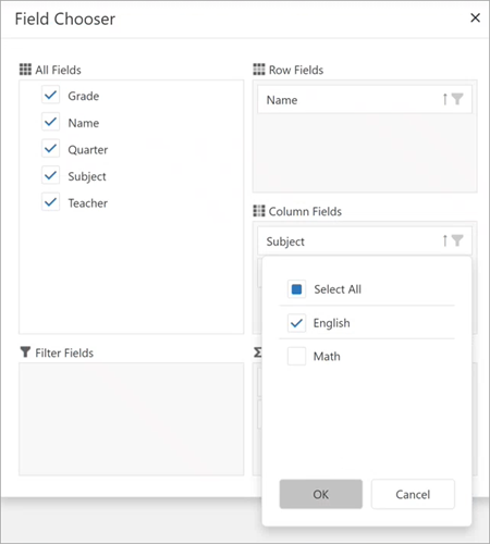
- Under All Fields, clear the check box for
Name. The field is removed from Row Fields. - Under All Fields, select the check box again for
Name.The
Namefield may not show up under Row Fields. It may show up under column or data fields. In such cases, drag and drop the field to the appropriate location.