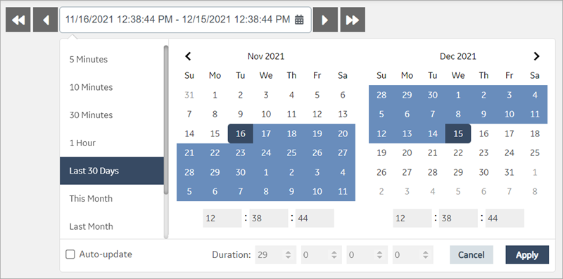
DateTime Range Picker
Use preset date ranges or create your own custom ranges for the calendar.
The datetime range picker widget is available under . When designing application pages, drag-and-drop GEDateTimeRangePicker to a container.
The following list of properties are specific to this widget. For common properties, refer to Page Components.
| Property | Description |
|---|---|
| Label | Enter a label name for the datetime range picker. |
| Default Duration | This is the default date range set for the widget. |
| Preset Ranges | These are pre-defined datetime ranges. Select the check box of the range to add to your calendar. |
| Auto update at startup | Select the check box to allow the datetime range picker to automatically
update the value of an input element it's attached to at initialization and
when the selected dates change. Note: Selecting the auto-update option
disables datetime selection in the calendar. |
| Custom Ranges | Create one or many customized datetime ranges to add to the calendar. |
| Data Targets | Configure one or more target outputs to receive values from the
widget. Note: For Historian queries, format data target values as
StartLocalISO and EndLocalISO for
Start Time and Stop Time respectively. |
| Data Sources | Configure one or more data sources to get values for the widget. |
| Show Scroll Buttons | Select the check box to allow scrolling through the dates. |
Datetime Range Picker at Runtime
