Flexbox Card
This layout offers a flexible and responsive design structure.
A flexbox card aligns and distributes the items along a main axis. Objects placed within a flexbox card are laid out next to each other, row-wise or column-wise. When we drag and drop plug-in objects, they get rearranged to follow the one-dimensional layout concept.
The ideal way to use a flexbox card is when you have objects that require flexibility to grow and shrink, and fit within the layout. Use the flexbox properties to control the alignment and distribution of the objects (items).
Flexbox Properties
| Field Name | Description |
|---|---|
| Columns | The card occupies the specified number of columns on the page grid. |
| Rows | The card occupies the specified number of rows on the page grid. |
| Position X | Applies to the horizontal placement of the card on the page. When the
value is 0, the card is placed on the left-most side of the
page. As you increase the value, the card moves away from the left side of the
page. |
| Position Y | Applies to the vertical placement of the card on the page. When the value
is 0, the card is placed at the top of the page. As you
increase the value, the card moves away from the top of the page. |
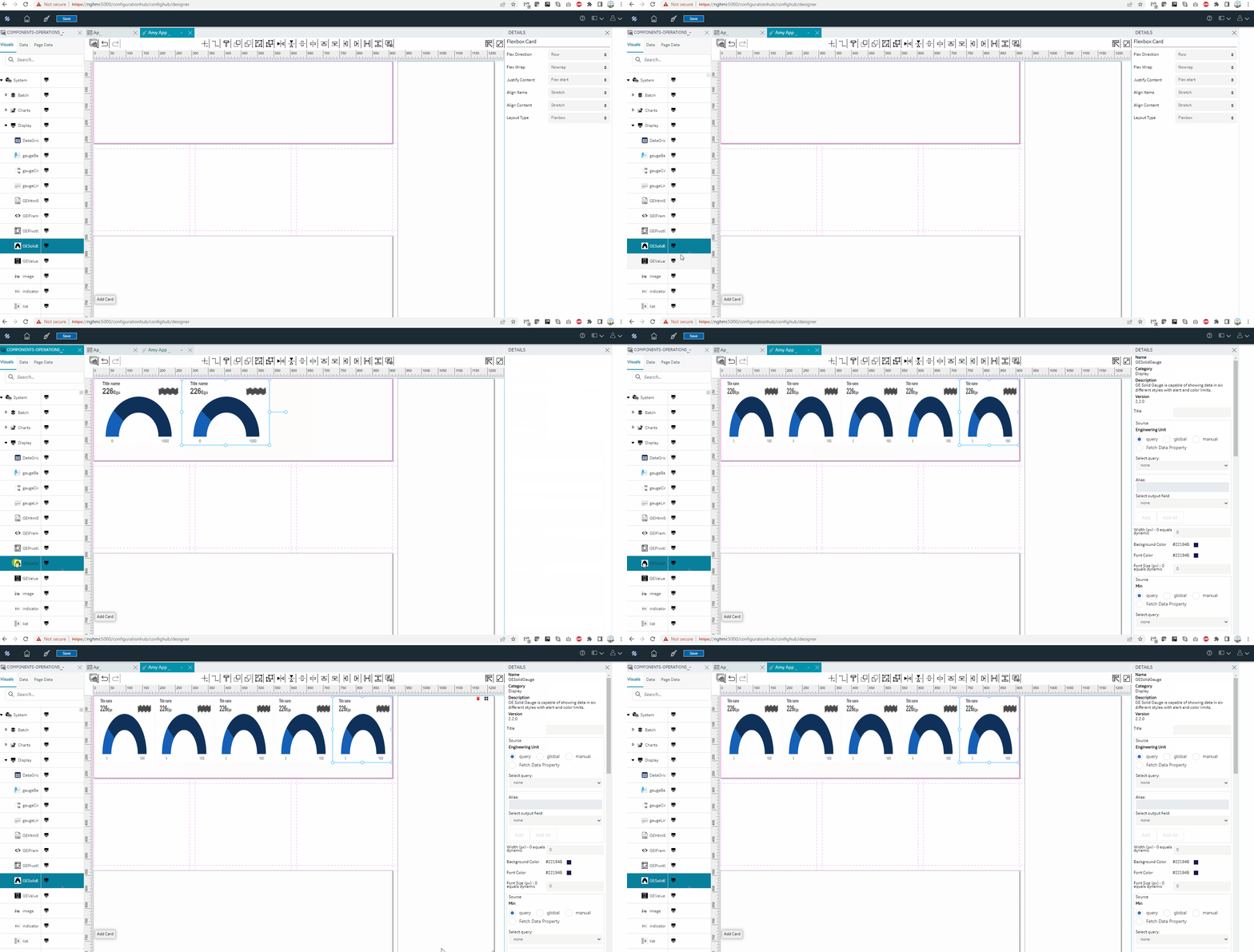
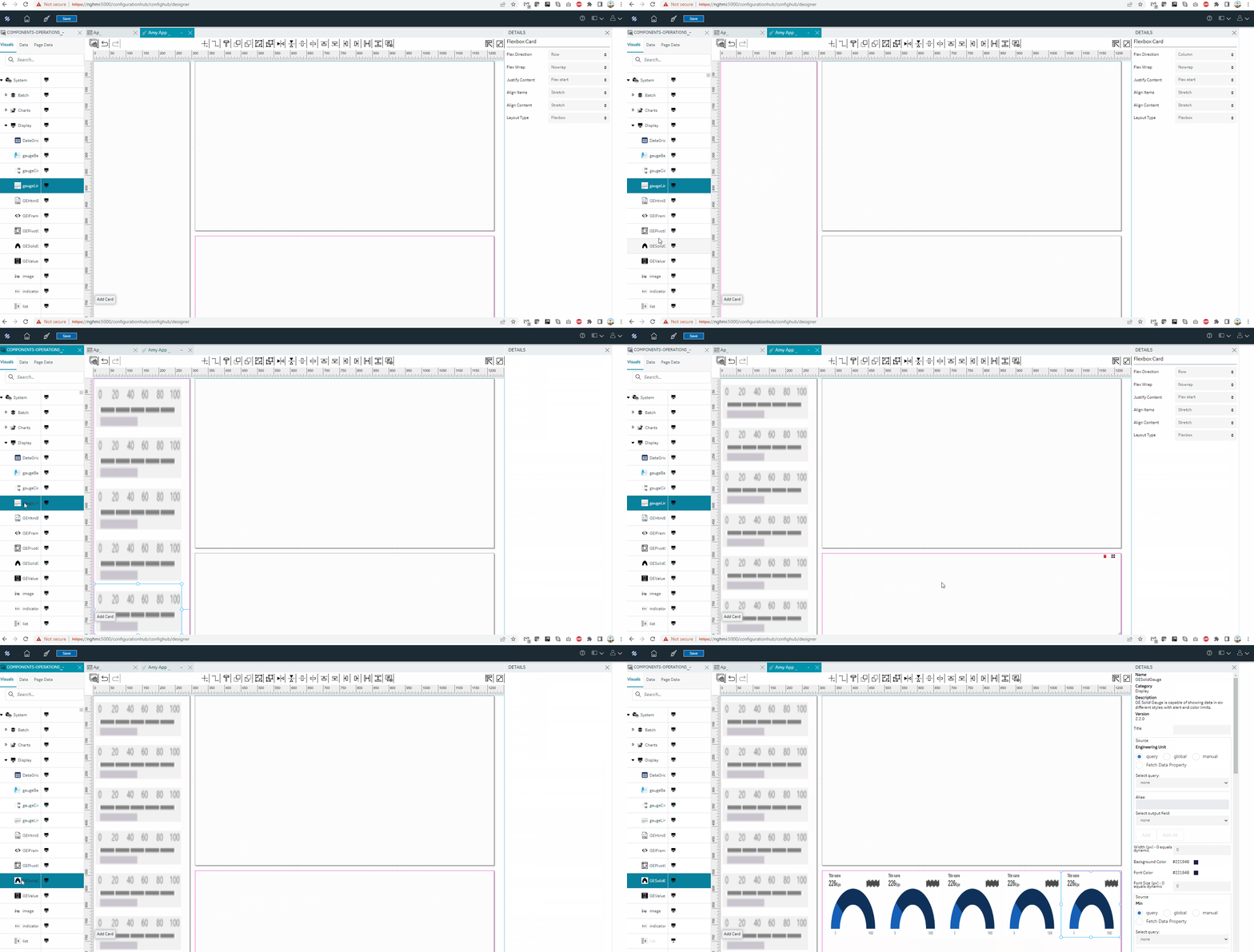
| Flex Direction | The objects are arranged next to each other based on these placement
directions:
See Flex Row, Flex Row and Column. |
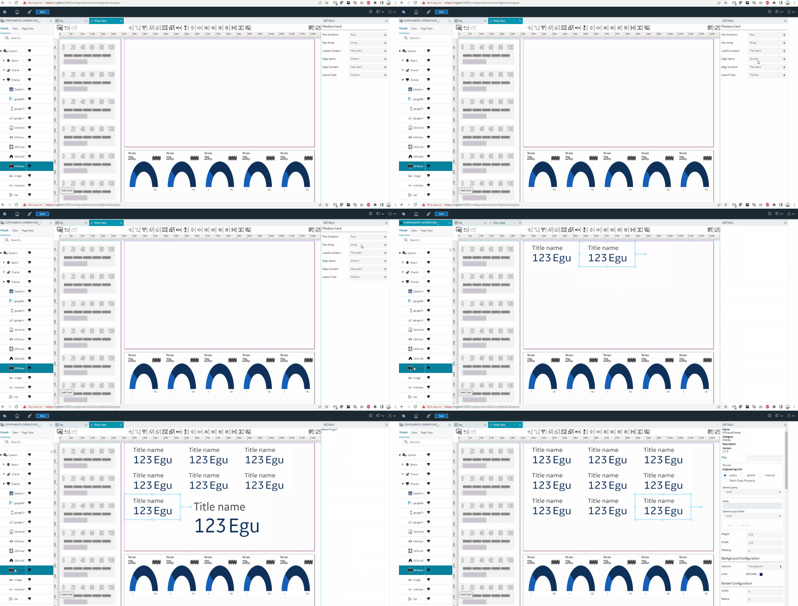
| Flex Wrap | By default, objects within the card are not wrapped.
See Flex Wrap. |
| Justify Content | You can choose from these options to align objects along the main axis
(left to right):
|
| Align Items | You can choose from these options to align objects along the cross axis
(top to bottom):
|
| Layout Type | Choose from the following card layouts before starting to design your
pages:
|
| Flex Grow | Enter a value for the object to grow in size with the flexbox layout. The value determines how much the object will grow in comparison to other objects within the layout. |
| Flex Shrink | Enter a value for the object to shrink in size with the flexbox layout. The value determines how much the object will shrink in comparison to other objects within the layout. |
| Flex Basis | This default property is the initial size of the objects within the flexbox layout. You can grow/shrink this size. |
| Style | Select these check boxes to format the objects:
|
| Function | Layout functionalities:
|
| Show/Hide | Select +Add Conditions to create conditions to show or hide the card. |
Flex Row

|
Flex Row and Column

|
Flex Wrap

|
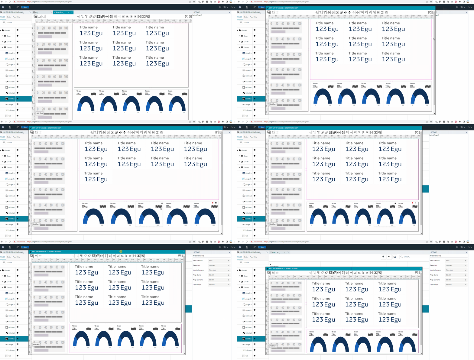
Resizing the Flexbox Layout

|