 Operations Hub
Date Picker
Add a calendar to display date and time in a variety of formats.
The calendar allows you to select specific date and time to use with queries and other data in the end application. All time related queries can make use of the date and time selection.
The date picker widget is available under . When designing application pages,
drag-and-drop GEDatePicker to a container.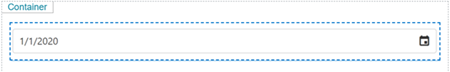
Specify these plug-in properties:
Note: When configuring input targets for plugins, ensure that no other binding exists for
the target query input. To remove a binding from the query input, select the unlink icon
next to the binding.
The following list of properties are specific to this widget. For common properties, refer to Page Components (Classic).
DatePicker Properties
| Field Name | Description |
|---|---|
| Title | Provide the text that appears as a label above the plug-in in the end application. |
| Type | Select from these options for display in the end application:
|
| Display Format | Select the format for the date and time display. Note: If date picker
output is used as an input for any of the extension type queries, then choose only these display
formats:
|
| Timezone | Select the timezone as local or UTC. Note: For Historian sources, use
'local' for timezone. |
| Source Input Value | Set this value to allow the plug-in to start displaying a specific date
and/or time when it loads in the end application.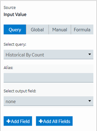 |
| Input Target | This is the value the plug-in provides as an output in the end
application. For example, you can choose a date/time/datetime that is passed to
the query, which requires a date time.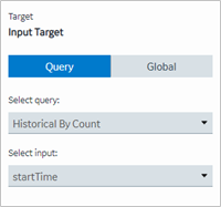 |
| Hidden | Select this check box if you want to hide the
plug-in. To show the hidden plug-in in Operations Hub new layout, go
to Page Visuals and under
Action column, select  for the hidden plug-in. See Page Visuals Tab. for the hidden plug-in. See Page Visuals Tab. |
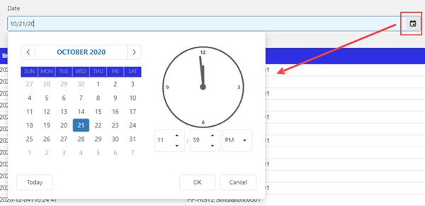
Date Picker at Runtime