Spares Analysis
About Site Filtering in Spares Analysis
In Spares Analysis, the site is assigned based on the user's selection in the Site control, and all of the imports and recommendations of a Spare Analysis must match the analysis's site assignment.
Consider an organization that has three sites, Site X, Site Y, and Site Z. The following Spares Analysis records exist:
- Spares Analysis A: Assigned to Site X
- Spares Analysis B: Assigned to Site Y
- Spares Analysis C: Assigned to Site Z
- Spares Analysis D: No site assigned (global record)
Scenario 1: User assigned to only Site X
This user will see Spares Analyses A and D.
Scenario 2: User assigned to both Site X and Site Y
This user will see Spares Analyses A, B, and D.
Scenario 3: Super User
This user will see Spares Analyses A, B, C, and D.
Spares Analysis Data Model
The following diagram shows how the families used in Spares Analysis are related to one another.
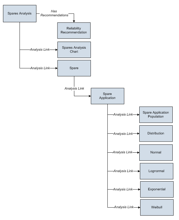
As you develop a Spares Analysis, you will create records in these families and link them together, either manually or automatically via the options in the APM system. Throughout this documentation, we use the term Spares Analysis to mean the combination of the Spares Analysis record and all the records that are linked to it.
About Spares Analysis Plots
On the Spares Analyses page, you can access any of the following graphs from the Analysis Summary workspace:
- Spare Level Plot
- Downtime Plot
- Spare Usage Plot
- Sensitivity Plot
- Optimal Holding Plot
When you run the Monte Carlo simulation for a Spares Analysis, each of the graphs will be generated for each Spare in the analysis. If more than one Spare exists in the Spares Analysis, multiple spares level graphs will be generated, according to the number of Spares in the analysis.
You can customize the appearance of the graph by using standard graph features.
Spare Level Plot
The Spare Level Plot is a bar graph that displays the cost associated with each possible spare level included in the range between the Min Inventory Level and Max Inventory Level values, which were specified in the Spare record.
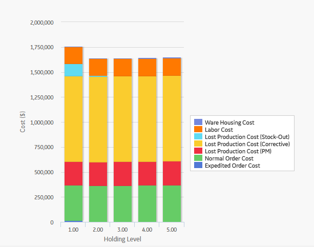
By default, each bar in the Spares Level Plot is divided into the following cost categories, which are shaded with different colors that are represented in the legend to the right of the graph:
- Warehousing Cost: The cost of storing the spare parts between failures.
- Labor Cost: The total cost of labor associated with every spare level.
- Lost Production Cost (Stock-Out): The total lost production cost accrued as a result of waiting for the spare to arrive when one must be ordered.
- Lost Production Cost (Corrective): The total lost production cost accrued as a result of the downtime due to preparation and repair after a failure.
- Lost Production Cost (PM): The total cost of lost production cost accrued as a result of the preventive maintenance activities. If the Enable Preventive Maintenance check box is selected in the Preventive Maintenance section, values from the Preventive Maintenance section will be included in this cost category.
- Normal Order Cost: The total cost of all normal orders placed for the spare parts.
- Expedited Order Cost: The total cost of all rushed orders placed for the spare parts.
The Warehousing Cost, Labor Cost, Lost Production Cost (Stock-Out), Lost Production Cost (Corrective), Lost Production Cost (PM), Normal Order Cost, and Expedited Order Cost values are displayed when you pause over the corresponding bar on the graph.
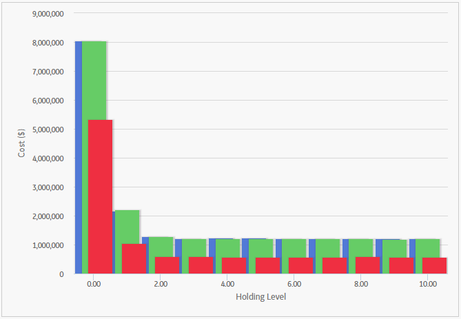
In addition to providing a Spare Level Plot graph for each Spare record in the analysis, APM also provides the Spare Level Plot for all the Spares within the selected Spares, which compares all Spare records according to the cost associated with each possible spare level. This graph enables you to estimate how much money your company might lose by not storing the optimal level of spare parts. The following image displays an example of the Spare Level Plot for all the Spares.
Downtime Plot
The Downtime Plot is a bar graph that displays the calculated downtime period during which the piece of equipment is expected not to be operating throughout the analysis period. The Downtime Plot displays the specific downtime associated with each spare level in the range indicated in the Spares section of the appropriate Spare record.
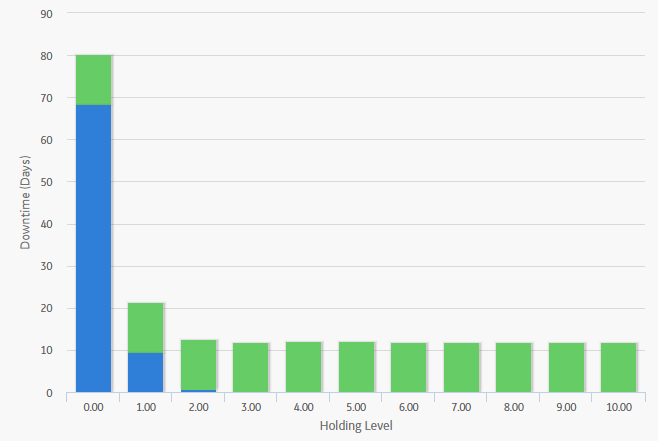
By default, each bar in the Downtime Plot is divided into the following downtime categories, which are shaded with different colors that are represented in the legend to the right of the graph:
- PM Downtime: The downtime that results from performing preventive maintenance. PM Downtime is calculated only if the Enable Preventive Maintenance check box is selected in the Preventive Maintenance section. If the Enable Preventive Maintenance check box is not selected, PM Downtime will always be zero.
- Corrective Downtime: The sum of the time spent preparing for the repair of the piece of equipment and actually repairing the piece of equipment (specified in the Preparation Time, Repair Time, and Total Correction Time fields in the Failure Consequence section).
- Stock-Out Downtime: The time period during which there was no spare part available for the necessary repair. For example, if you do not have any spare parts stored when a piece of equipment fails, you will need to order a spare part. If the sum of the values in Normal Order Time and On-site Delivery Time fields (both specified in the Spare section) takes longer than the value specified in the Preparation Time field (specified in the Failure Consequence section), then there will be a period of stock-out downtime while you wait for the spare part(s) to arrive at the repair site.
The PM Downtime, Corrective Downtime, and Stock-Out Downtime values are displayed when you pause over the corresponding bar on the graph.
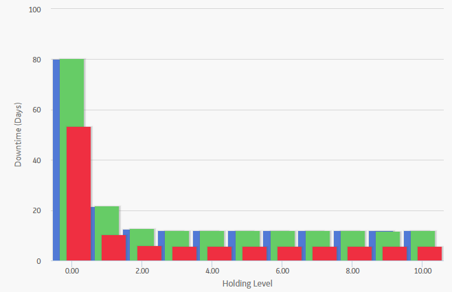
In addition to providing a Downtime Plot graph for each Spare record in the analysis, APM also provides the Downtime plot for all the Spares within the selected Spares, which compares all Spare records according to the amount of downtime associated with each possible spare level. This graph enables you to estimate how many days of downtime that you might have per possible spare level for each piece of equipment. The following image displays an example of the Downtime Plot for All Spares.
Spare Usage Plot
The Spare Usage Plot is a bar graph that displays the calculated spare usage for each year in the analysis period. The spares usage is based on failure rates that the user entered for a given population, and the quantity and ages of the population.
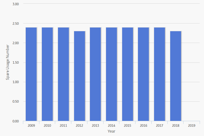
In this image, the Simulation Start Date is 1/1/2015, and the Simulation End Date is 1/1/2025. The x-axis displays the years for the analysis period, and the y-axis displays the number of spares that are calculated to be used in that year.
By default, each bar in the Spare Usage Plot is divided into the following spare usage categories, which are shaded with different colors that are represented in the legend to the right of the graph:
- PM Usage: The total number of spare parts used for Preventive Maintenance (specified in the # of Required Spares field in the Failure Consequence section). If the Enabled Preventive Maintenance check box in the Preventive Maintenance section is not selected, PM Usage will not be included in this graph.
- Corrective Usage: The total number of spare parts used for repairing equipment failures (specified in the Failure Consequence section).
The PM Usage and the Corrective Usage values are displayed when you pause over the corresponding bar on the graph.
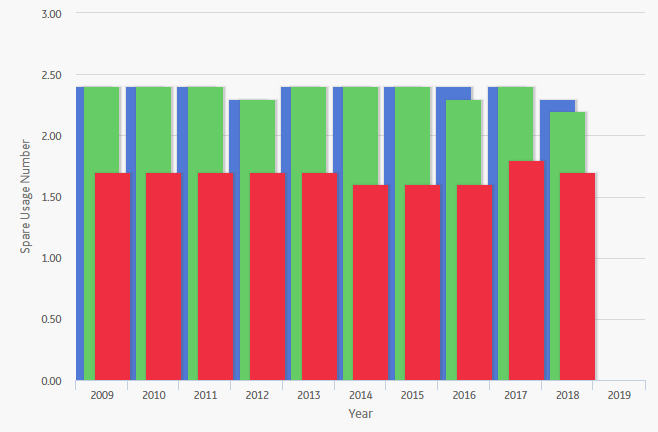
In addition to providing a Spare Usage Plot for each Spare record in the Analysis, APM provides the Spare Usage Plot for all the Spares within the selected Spares, which compares all Spare records within a given analysis. The comparison is based on the spare usage for each year. This graph enables you to estimate how many of each spare part you might need each year.
Sensitivity Plot
The Sensitivity Plot is a line graph that displays for each year in the analysis period:
- The cost associated with holding the optimal number of spare parts.
- The cost of holding one less spare part than the optimal number.
- The cost of holding one more spare part than the optimal number.
For example, if the optimal level determined by the Monte Carlo simulation is three, then the Sensitivity Plot will display the cost associated with holding three spare parts, two spare parts, and four spare parts.
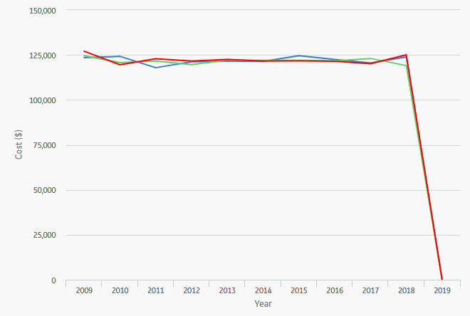
In this image, the x-axis displays the years for the analysis period, and the y-axis displays the costs that you can expect to incur in each year.
By default, each line in the Sensitivity Plot is divided into the following cost categories, which are shaded with different colors that are represented in the legend to the right of the graph:
- Total Cost (+): The total cost when storing one spare part more than the recommended number of spare parts.
- Total Cost (Optimal): The total cost when storing the recommended number of spare parts. The Optimal Spare Level, or recommended number of spare parts, is located at the top of the Spare Level Plot.
- Total Cost (-): The total cost when storing one spare part less than the recommended number of spare parts.
The Total Cost (+), Total Cost (Optimal), and Total Cost (-) values are displayed when you pause over the corresponding bar on the graph.
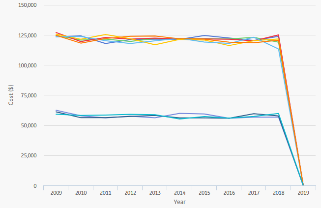
In addition to providing a Sensitivity Plot for each Spare record in the analysis, APM provides the Sensitivity Plot for all the Spares within the selected Spares, which compares all Spare records within a given analysis. The comparison is based on the cost of storing the optimal amount of the spare part, one spare part more than the optimal amount, and one spare part less than the optimal amount. This graph enables you to estimate the cost of storing the optimal amount, one more than the optimal amount, and one less than the optimal amount of each spare part during analysis period. The following image shows an example of the Sensitivity Plot for All Spares.
Optimal Holding Plot
The optimal spare level is determined as the most conservative value over the entire analysis period. Because failure data might change each year, the optimal inventory level might change for each year within the analysis period. The Optimal Holding Plot displays the optimal spare level for the whole period and for each individual year of the analysis period.
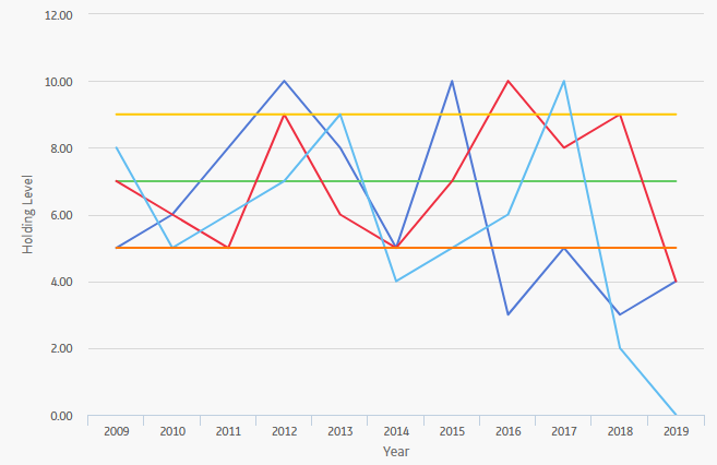
Consider the following Optimal Holding Plot from the data used in the Spares Analysis example.

In this image, the Simulation Start Date is set to 6/1/2009, and the Simulation End Date is set to 6/1/2019 in the Spares Analysis record. The x-axis displays the years included in the analysis period, and the y-axis displays the inventory level associated with the lowest cost of spares levels for each year.
By default, each bar in the Optimal Holding Plot is divided into the following cost categories, which are shaded with different colors that are represented in the legend to the right of the graph:
- Optimal Spare Level (Yearly): The lowest cost of spare levels associated with each year included in the analysis period.
- Optimal Spare Level (Whole Period): The recommended number of spare parts associated with the entire analysis period.
The Optimal Spare Level (Yearly) and the Optimal Spare Level (Whole Period) values are displayed when you pause over the corresponding bar on the graph.
In addition to providing an Optimal Holding Plot for each Spare record in the analysis, APM provides the Optimal Holding Plot for all the Spares within the selected Spares, which compares all Spare records within a given analysis. The comparison is based on the optimal holding level for the whole period and for each individual year during the analysis period. The following image displays an example of the Optimal Holding Plot for All Spares, which you can use to compare the optimal holding levels for each piece of equipment.
