On the Spares Analyses page, you can access any of the following graphs from the Analysis Summary workspace:
When you run the Monte Carlo simulation for a Spares Analysis, each of the graphs will be generated for each Spare in the analysis. If more than one Spare exists in the Spares Analysis, multiple spares level graphs will be generated, according to the number of Spares in the analysis.
You can customize the appearance of the graph by using standard graph features.
The Spare Level Plot is a bar graph that displays the cost associated with each possible spare level included in the range between the Min Inventory Level and Max Inventory Level values, which were specified in the Spare record.
Note: Interaction with graphs is not available on touch-screen devices.
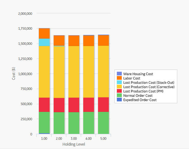
By default, each bar in the Spares Level Plot is divided into the following cost categories, which are shaded with different colors that are represented in the legend to the right of the graph:
The Warehousing Cost, Labor Cost, Lost Production Cost (Stock-Out), Lost Production Cost (Corrective), Lost Production Cost (PM), Normal Order Cost, and Expedited Order Cost values are displayed when you pause over the corresponding bar on the graph.
Hint: If you select the Show Total Only check box in the upper-right corner of the graph, then you can view the total costs associated with each spare level.
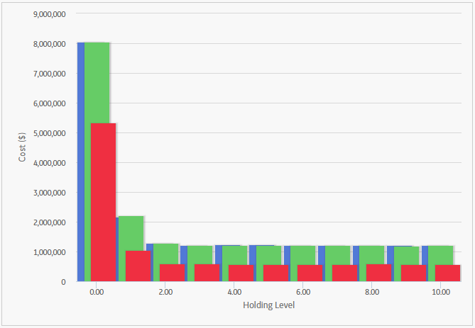
In addition to providing a Spare Level Plot graph for each Spare record in the analysis, GE Digital APM also provides the Spare Level Plot for all the Spares within the selected Spares, which compares all Spare records according to the cost associated with each possible spare level. This graph enables you to estimate how much money your company might lose by not storing the optimal level of spare parts. The following image displays an example of the Spare Level Plot for all the Spares.
The Downtime Plot is a bar graph that displays the calculated downtime period during which the piece of equipment is expected not to be operating throughout the analysis period. The Downtime Plot displays the specific downtime associated with each spare level in the range indicated in the Spares section of the appropriate Spare record.
Note: Interaction with graphs is not available on touch-screen devices.
By default, each bar in the Downtime Plot is divided into the following downtime categories, which are shaded with different colors that are represented in the legend to the right of the graph:
The PM Downtime, Corrective Downtime, and Stock-Out Downtime values are displayed when you pause over the corresponding bar on the graph.
Hint: If you select the Show Total Only check box in the upper-right corner of the plot, you can view the total downtime associated with each spare level.
In addition to providing a Downtime Plot graph for each Spare record in the analysis, GE Digital APM also provides the Downtime plot for all the Spares within the selected Spares, which compares all Spare records according to the amount of downtime associated with each possible spare level. This graph enables you to estimate how many days of downtime that you might have per possible spare level for each piece of equipment. The following image displays an example of the Downtime Plot for All Spares.
The Spare Usage Plot is a bar graph that displays the calculated spare usage for each year in the analysis period. The spares usage is based on failure rates that the user entered for a given population, and the quantity and ages of the population.
Note: Interaction with graphs is not available on touch-screen devices.
In this image, the Simulation Start Date is 1/1/2015, and the Simulation End Date is 1/1/2025. The x-axis displays the years for the analysis period, and the y-axis displays the number of spares that are calculated to be used in that year.
By default, each bar in the Spare Usage Plot is divided into the following spare usage categories, which are shaded with different colors that are represented in the legend to the right of the graph:
The PM Usage and the Corrective Usage values are displayed when you pause over the corresponding bar on the graph.
Hint: If you select the Show Total Only check box in the upper-right corner of the graph, you can view the total usage associated with each year in the analysis period.
In addition to providing a Spare Usage Plot for each Spare record in the Analysis, GE Digital APM provides the Spare Usage Plot for all the Spares within the selected Spares, which compares all Spare records within a given analysis. The comparison is based on the spare usage for each year. This graph enables you to estimate how many of each spare part you might need each year.
The Sensitivity Plot is a line graph that displays for each year in the analysis period:
For example, if the optimal level determined by the Monte Carlo simulation is three, then the Sensitivity Plot will display the cost associated with holding three spare parts, two spare parts, and four spare parts.
Note: Interaction with graphs is not available on touch-screen devices.
In this image, the x-axis displays the years for the analysis period, and the y-axis displays the costs that you can expect to incur in each year.
By default, each line in the Sensitivity Plot is divided into the following cost categories, which are shaded with different colors that are represented in the legend to the right of the graph:
The Total Cost (+), Total Cost (Optimal), and Total Cost (-) values are displayed when you pause over the corresponding bar on the graph.
Note: If the Min Inventory Level is 0 (zero), the Max Inventory Level is 1, and the Optimal Spare Level is 1, then the Total Cost (+) line will not appear on the Sensitivity Plot. With this inventory range specified on the Spare record, the Total Cost (+) line would represent the holding level of two spare parts, and that value is not within the inventory range.
In addition to providing a Sensitivity Plot for each Spare record in the analysis, GE Digital APM provides the Sensitivity Plot for all the Spares within the selected Spares, which compares all Spare records within a given analysis. The comparison is based on the cost of storing the optimal amount of the spare part, one spare part more than the optimal amount, and one spare part less than the optimal amount. This graph enables you to estimate the cost of storing the optimal amount, one more than the optimal amount, and one less than the optimal amount of each spare part during analysis period. The following image shows an example of the Sensitivity Plot for All Spares.
The optimal spare level is determined as the most conservative value over the entire analysis period. Because failure data might change each year, the optimal inventory level might change for each year within the analysis period. The Optimal Holding Plot displays the optimal spare level for the whole period and for each individual year of the analysis period.
Note: Interaction with graphs is not available on touch-screen devices.
Consider the following Optimal Holding Plot from the data used in the Spares Analysis example.
In this image, the Simulation Start Date is set to 6/1/2009, and the Simulation End Date is set to 6/1/2019 in the Spares Analysis record. The x-axis displays the years included in the analysis period, and the y-axis displays the inventory level associated with the lowest cost of spares levels for each year.
By default, each bar in the Optimal Holding Plot is divided into the following cost categories, which are shaded with different colors that are represented in the legend to the right of the graph:
The Optimal Spare Level (Yearly) and the Optimal Spare Level (Whole Period) values are displayed when you pause over the corresponding bar on the graph.
In addition to providing an Optimal Holding Plot for each Spare record in the analysis, GE Digital APM provides the Optimal Holding Plot for all the Spares within the selected Spares, which compares all Spare records within a given analysis. The comparison is based on the optimal holding level for the whole period and for each individual year during the analysis period. The following image displays an example of the Optimal Holding Plot for All Spares, which you can use to compare the optimal holding levels for each piece of equipment.
Copyright © 2018 General Electric Company. All rights reserved.