The Loop Report
About the Loop Report
The Loop Report provides a systematic approach to optimizing the performance of a control loop by monitoring the loop performance and providing diagnostic data about the loop. The report contains various charts and tables that help in assessing the performance of a control loop. The data used for assessing the performance of the loop is derived from the tags associated with the control loop assets.
The Loop Report: Charts
- Process Variable Performance
- Manipulated Variable Distribution (%)
- Control Overview
- Error Distribution
The Loop Report: Tables
- Control Mode Summary
- Controller Performance
- PV Performance
- Error Statistics
- Controller Configuration
Access the Loop Report
About This Task
Procedure
Modify the Date for a Loop Report
About This Task
Procedure
The Process Variable Performance Chart
The process variable performance (PVP) chart helps in analyzing the trend of the process variable (PV) against the setpoint (SP).
- x-axis: Represents the time period selected in the control loop report.
- y-axis: Represents the PV and SP values.
| Trend Line | Description |
|---|---|
| PV | A step chart representing the trend of PV over the time period selected in the report. Consult the CLPM Terminology table for the definition of the PV. |
| SP | A step chart representing the trend of SP over the time period selected in the report. Consult the CLPM Terminology table for the definition of the SP. |
| Upper Limit | A step chart representing the trend of the acceptable upper limit for the PV value. The Upper Limit on this chart represents the Upper SP Threshold KPI. Consult the KPI Reference for the definition of the Upper SP Threshold. |
| Lower Limit | A step chart representing the trend of the acceptable lower limit for the PV value. The Lower Limit on this chart represents the Lower SP Threshold KPI. Consult the KPI Reference for the definition of the Lower SP Threshold. |
Interpreting the PVP Chart
| What You See | Interpretation | Suggested Action |
|---|---|---|
| The trend of the PV values is centered around the trend of the SP values. | Process is under control. | None. Maintain the parameter settings. |
| The trend of the PV values exceeds the trend of the upper or lower limit. | Process is not under control. | Tune the control loop to reduce process variation. |
| Gaps in the trend line. | The plotted data contains a mix of good and bad quality data. | Investigate why the quality of some data is bad. |
|
A flat trend line appears. |
|
|
| An empty chart. | The quality of all the data for the selected time period is bad. | Investigate why the quality of data is bad. |
The Manipulated Variable Distribution Chart
The manipulated variable distribution (%) chart is a histogram that helps you analyze the efficiency of a control element and evaluate the suitability of the element for the process.
A control element receives the output signal from the controller and controls the operating conditions such as flow, pressure, temperature, and liquid level in response to the signal. The manipulated variable (MV) is a percentage measure of the value at which the control element is functioning. For example, in the temperature control loop in an air conditioner, based on how much cooling is required (that is, setpoint), the thermostat (that is, the controller) sends a signal to manipulate the flow of cooling agent such that the room temperature (that is, the process variable) is adjusted to match the desired temperature. In this example, MV is the percentage of flow of cooling agent allowed through the valve.
- x-axis: Represents the value of the MV measured in percentage
- y-axis: Represents the count of samples of the MV
Interpreting the Manipulated Variable Distribution Chart
| What you see | Interpretation | Required action |
|---|---|---|
| Red bars appear. |
The samples can be interpreted as follows:
| Install a different type of controller, either a larger one that is more suitable for the purpose, or a smaller one that is more energy-efficient and cost-effective. |
| Yellow bars appear. |
The samples can be interpreted as follows:
| Monitor the control element for signs of asset fatigue. |
| Blue bars appear. | The controller is operating at the desired capacity, that is, in the range of 31% through 70%. More samples in this range indicate that the controller is well-designed. | None. This is the ideal value. |
| Image displays a message stating that there is no data. | Data is not available for the selected time period. | Investigate if there is a loss of connection with the database. |
| An empty histogram appears. | The quality of all the data for the selected time period is bad. | Investigate why the quality of data is bad. |
| One trend interval (bin) appears with majority of data counts. |
This indicates that there has been no data change, and that the last recorded value has been maintained. This can possibly occur as a result of loss of connection to a real-time server. | Verify and fix the connection to the real-time server. |
| Flat histogram, with no discernible peaks, appears. | The control element is operating over its whole range to control the PV. This typically indicates that the control element is too small for the system and will cause asset fatigue over time. | Optimize the size of the control element. |
The Control Overview Chart
- x-axis: Represents the time period selected in the report.
- y-axes (two in number): Represent the MV value and the control mode in which the control loop was operating over the time period. The following table provides the number that represents each control mode:
Number Control Mode 1 Manual 2 Auto 3 Cascade 4 Shutdown
- Blue: Indicates the control mode in which the system is operating. The control mode can change over the recording period.
- Red: Indicates the trend of the MV value over the total calibrated range.
Interpreting the Control Overview Chart
| What you see | Interpretation | Required action |
|---|---|---|
| The blue trend line is set to Shutdown. | Indicates that the control element is in the Shutdown mode. |
Ensure that the system is operating in the required control mode. Investigate causes of a change to Shutdown mode. |
| The red trend line indicates the MV percentage functioning value over the total calibrated range. |
|
Optimize the size of the controller.
|
| The blue trend line is set to Bad. | The data was of bad quality and loop statistics could not be calculated. |
Identify the reason for bad quality data. Check the connection to the server or database. |
| A report with no value for MV in the y-axis appears. | Either the MV has no data or the data is of bad quality. | Investigate which of these is true and why. |
| Gaps in the trend line appear. | Data was a mixture of good and bad quality. | Investigate why the quality of some data is bad. |
| A flat trend line appears. |
|
|
| The Control Mode and MV values are responding quickly relative to the PV and SP values in the PV trend. | The control element has an appropriate reaction to changes in the PV. | None. The controller is well-tuned. |
| The Control Mode and MV values are responding very slowly relative to the PV and SP values in the PV trend. | The control element has a sluggish reaction to changes in the PV. | Tune the control loop PIDF parameters. |
The Error Distribution Chart
- x-axis: Represents the controller error.
- y-axis: Represents the time for which the controller was operating at the PV error value.
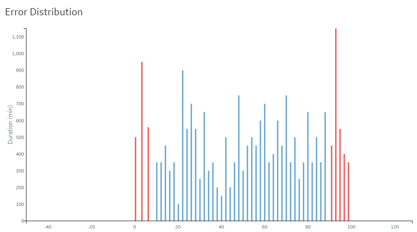
Interpreting the Error Distribution Chart
| What you see | Interpretation | Required action |
|---|---|---|
| The histogram bars appear in red. | The error is out of acceptable limits. | Control the PV so that it functions within the defined process limits. |
| The histogram bars appear in blue. | The error is in acceptable limits. | None. |
| Bimodal or oscillating distribution of histogram bars appears. | Possible friction exists in control element. | Check the functioning of the control element. |
|
Histogram bars appear primarily in the higher error range. | Possible errors in loop tuning exist, or the control element is not working effectively. |
Check the functioning of the control element. Tune the PIDF controller parameters. |
|
One trend interval (bin) appears with majority of data counts. |
There has been no change in PV error for the time period selected. The last recorded value is maintained. Or, the connection to a real-time server has been lost. |
Investigate why there is no change in data. Fix the connection to the real-time server. |
| An empty histogram appears. | The quality of all the data for the selected time period is bad. | Investigate why the quality of data is bad. |
The Control Mode Summary Table
- Manual
- Auto
- Cascade
- Shutdown
| Column name | Description |
|---|---|
| Duration (%) | Indicates the percentage of time the control loop operated in each controller mode. This is the average value of the Percentage <control mode> KPI. |
| Lower Limit Exceeded (%) | Indicates the percentage of time the loop operated below the lower limit. This is the average value of the Percentage <control mode> LL Exceeded KPI. |
| Upper Limit Exceeded (%) | Indicates the percentage of time the loop operated above the upper limit. This is the average value of the Percentage <control mode> UL Exceeded KPI. |
| Total Limits Exceeded (%) | Indicates the total percentage of time that the loop operated out of limit. This value is calculated as the sum of the Lower Limit Exceeded (%) and Upper Limit Exceeded (%) values. |
The last row in the table, Total, contains the sum of values in each column for all control modes, except the Shutdown mode.
In the Total row, if the value in the Duration (%) column is not 100%, it indicates missing data for the selected time period, possibly due to bad quality data.
The Controller Performance Table
| KPI | Interpretation | Required action |
|---|---|---|
|
Manipulated Variable [%] |
The average value of the control variable, expressed as a percentage.
This is the average value of the Percentage Controller Output KPI. |
If the variable is not in the ideal range, install a different type of controller. Depending on the variable value, install either a larger controller that is more suitable for the process, or a smaller one that is more energy-efficient and cost-effective. |
|
Total MV Movement |
An indication of the absolute sum of all changes made in the MV. The closer the value for this variable is to zero, the closer the MV is to staying at a constant value. You can use this statistic to help you keep the PV operating within process limits. This is the average value of the Movement Index KPI. |
Investigate and optimize the size of the control system. |
|
Average MV Change [%] |
The average percentage change in the MV between samples. The closer the value for this variable is to zero, the closer the MV is to staying at a constant value. This is the average value of the Control Amplitude KPI. |
Investigate and optimize the size of the control system. |
|
MV Oscillation Count [#] |
The number of times that the MV changes direction. This indicates the level of noise in the system. The closer this value is to zero, the less noise there is in the system. All data is taken into account for this statistic, regardless of the quality. This is the average value of the MV Oscillation Count KPI. |
Add a better filter to the control system. |
|
Average oscillation amplitude [%] |
The average percentage change in the MV before changing direction.
This is the average value of the Reversal Amplitude KPI. |
Investigate and optimize the control element. |
|
MV Saturation [%] |
The percentage of the reporting window for which the controller output is saturated. The controller output is considered saturated when the MV has a value of 0 (the lower limit for controller output saturation) or 100 (the upper limit for controller output saturation). The closer this is to zero, the more likely it is that the control element is appropriately sized and functioning correctly. This is the average value of the Percentage MV Saturation KPI. |
Investigate for a possibility of an undersized or oversized control element, a malfunctioning control element, or other causes for MV saturation, and optimize the control element. |
|
Duration Not Utilized [%] |
The percentage of the reporting window for which the loop is not in use. The loop is considered to be not in use if it is in manual mode or if the controller output is saturated. The controller output is considered saturated when the MV has a value of 0 (the lower limit for controller output saturation) or 100 (the upper limit for controller output saturation). The closer this is to zero, the more likely it is that the loop is in a mode other than manual and the control element is appropriately sized and functioning correctly. This is the average value of the Percentage Not Utilized KPI. |
If the percentage of time not utilized is too high this can be for either or both of the following reasons:
|
The PV Performance Table
| Column name | Interpretation |
|---|---|
|
Average PV Limits exceeded |
This value is an average of the percentage of time the PV exceeded the upper or lower limits. This is the average value of the Percentage Limits Exceeded KPI. |
|
PV Variance [%] |
This value is a measure of the average deviation of the PV from the average PV, expressed as a percentage of the reporting window span. This is the average value of the PV Variance KPI. |
|
PV Variability |
This value is an averaged measure of how spread or closely clustered the PV data set is, expressed as a percentage This is the average value of the PV Variability KPI. |
The Error Statistics Table
| Measured variable | Interpretation |
|---|---|
|
Integrated Error |
This value indicates the percentage time the process has spent out of limits. If there is a substantial integrated error, investigate the functioning of the PV, and tune the system to maintain the PV within the defined limits. This is the sum of the Integrated Sum KPI values for the window. |
|
Average Error |
This value indicates the average tag error. Tag error is the difference between process variable and set point, expressed as a percentage. This is the average value of the PV Error Average KPI. |
|
Average Absolute Error |
This value indicates the average absolute value of the tag error. This is the average value of the PV Error Absolute Average KPI. |
|
PV Error Standard Deviation |
This value indicates the standard deviation of the tag error, where the tag error is the difference between process variable and set point, expressed as a percentage. This is the average value of the PV Error Standard Deviation KPI. |
The Controller Configuration Table
The controller configuration table contains the Proportional (P), Integral (I), Derivative (D), or Filter (F) values at the beginning and end of the selected time period.