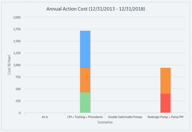
The Annual Action Cost graph displays the average cost of actions per year for each Scenario.
The following image displays an example of the Annual Action Cost graph.

Note: If you prefer to see the various cost categories added together and presented in a single column for each Scenario, in the upper-right corner of the Summary section, select the Show Total check box.
You can also compare the cost of different types of actions on this graph.
Note: Interaction with graphs is not available on touch-screen devices.
Copyright © 2018 General Electric Company. All rights reserved.