Reliability Growth
About Site Filtering in Reliability Growth Analysis
In Reliability Growth Analysis, the site is assigned based on the user's selection in the Site control.
Data for the analysis can be generated by a query that contains records from multiple sites. Analyses that are created for a single site and that are based on a query containing multi-site data will contain multi-site data. A single-site user with access to the analysis can open the analysis and view all of the multi-site data in an analysis.
A user that has been assigned, at a minimum, to all of the sites that are associated with the records queried by the analysis will have full access to modify the analysis. If this user reloads the analysis, the query will return data based on the sites that were assigned at the time the analysis was created.
A user that has not been assigned to all of the sites that are associated with the records queried by the analysis will be able to view the analysis, but will not be able to reload or edit the data.
Consider an organization that has three sites, Site X, Site Y, and Site Z. The following Reliability Growth Analysis records exist:
- Reliability Growth Analysis A: Assigned to Site X
- Reliability Growth Analysis B: Assigned to Site Y
- Reliability Growth Analysis C: Assigned to Site Z
- Reliability Growth Analysis D: No site assigned (global record)
Scenario 1: User assigned to only Site X
This user will see Reliability Growth Analyses A and D.
Scenario 2: User assigned to both Site X and Site Y
This user will see Reliability Growth Analyses A, B, and D.
Scenario 3: Super User
This user will see Reliability Growth Analyses A, B, C, and D.
Reliability Growth Analysis Data Model
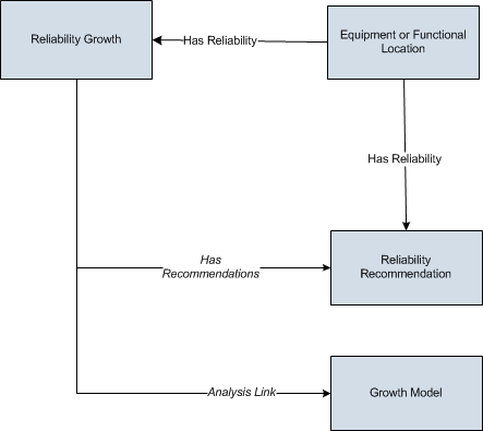
The following diagram shows how the families used in Reliability Growth Analysis are related to one another.

As you develop a Reliability Growth Analysis, you will create records in these families and link them together, either manually or automatically via the options in the APM Framework. Throughout this documentation, we use the term Reliability Growth Analysis to mean the combination of the Reliability Growth record and all the records that are linked to it.
About Data Mapped to the Baseline Analysis <Source Type> Window
When you create a Reliability Growth Analysis from a query or dataset, the Reliability Growth Builder will prompt you to map values from columns in the query or dataset to certain values in the Reliability Growth Analysis. The values that you select to map on the Select Data Fields and Provide Information For Downtime screens in the Reliability Growth Builder will then appear in the associated columns in the Baseline Analysis <Source Type> window. The <Source Type> is Query or Dataset on which your analysis is based.
This family is enabled for site filtering, which means that records in this family can be assigned to a specific site, and will only be accessible to users who are assigned to the same site and have the appropriate license and family privileges. For more information, refer to the Sites section of the documentation.
Details
The following table displays which columns are mapped from fields in the Reliability Growth Builder to columns in the <Measurement> Data window:
| Reliability Growth Builder Screen | Reliability Growth Builder Field | Baseline Analysis <Source Type> Window Column |
|---|---|---|
| Provide Information for Downtime | Downtime Field | Downtime |
| Select Data Fields | Asset ID | Asset ID |
| Select Data Fields | Date | Failure Date |
| Select Data Fields | Cumulative Operating Time | COT(units) |
| Select Data Fields | <Measurement> | <Measurement> |
| Select Data Fields | Installation Date | Installation Date |
Examples for Reliability Growth
The following examples explain how a Reliability Growth Analysis can be used as an evaluation tool in different scenarios.
Example 1: Analysis Using Failure Event Dates
The following example demonstrates a scenario where you would create a Reliability Growth Analysis with event-based data that is measured using failure dates.
If you track events (e.g., safety events or failures) by specific date, then you can create a Reliability Growth Analysis using event-based data that is measured using failure dates.
Centrifugal Pump 1051700 was installed at the Springfield plant on July 20, 1998. Since its installation, the pump has failed several times, and each time the pump fails it is repaired immediately without any significant downtime. You have collected data noting which days the pump failed. You want to use the following data to perform a Reliability Growth Analysis to determine the mean time between pump failures.
| Failure Dates | Number of Failures |
|---|---|
|
12/14/1998 |
1 |
|
2/7/1999 |
1 |
|
6/26/1999 |
1 |
|
8/1/1999 |
1 |
|
9/5/1999 |
1 |
|
1/1/2001 |
1 |
|
1/2/2001 |
1 |
|
2/7/2002 |
1 |
|
7/11/2002 |
1 |
|
12/10/2002 |
1 |
|
5/12/2003 |
1 |
|
7/2/2003 |
1 |
|
11/28/2005 |
1 |
|
1/30/2006 |
1 |
In this case, you would use event-based data derived from failure dates to predict:
- The date when the pump will fail next.
- How many times the pump will fail by a certain date.
- If the number of failures increased or decreased as a result of a strategy change (e.g., a new preventative maintenance schedule), which was implemented after the failure on September 5, 1999.
Example 2: Analysis Using Cumulative Operating Time
The following example demonstrates a scenario where you would create a Reliability Growth Analysis with event-based data that is measured using cumulative operating time.
Sometimes the specific days on which a piece of equipment or location fails may not be available, or the piece of equipment or location may not operate for the same amount of time every day. In these cases, it would be more valuable to predict future failures using cumulative operating time (COT), or the amount of time the piece of equipment or location has been in operation.
Haul Truck 1 was purchased for a shipping firm as a used vehicle with 11,028 miles. The truck now runs varied routes depending on the number of shipments to which it is assigned. Because the truck does not always travel the same number of miles each day, you collect the data representing the mileage points at which the truck broke down. You want to use the following data to perform a Reliability Growth Analysis to determine the mean operating time (i.e., number of miles) between failures.
| Cumulative Operating Time (Miles) | Number of Failures |
|---|---|
|
27,393 |
1 |
|
41,675 |
1 |
|
60,400 |
1 |
|
66,128 |
1 |
|
72,132 |
1 |
|
77,314 |
1 |
|
113,888 |
1 |
|
146,671 |
1 |
|
205,424 |
1 |
|
224,624 |
1 |
|
243,841 |
1 |
|
260,828 |
1 |
|
279,951 |
1 |
|
303,156 |
1 |
In this case, you would use event-based data derived from cumulative operating time to predict:
- The mileage point at which the next failure will occur.
- How many failures will occur by a certain mileage point (e.g., five failures will have occurred after 1,000 miles).
- If the number of failures increased or decreased as a result of a strategy change (e.g., more routine oil changes), which was implemented after the failure at 77,314 miles.
Example 3: Analysis Using Grouped and Non-Event Data
In Examples 1 and 2, each datapoint represents a single measurement or failure. In some datasets, each datapoint may represent more than one measurement, or an amount of data. Throughout this documentation, this type of data is referred to as grouped data. To perform Reliability Growth Analyses on grouped data, when you create a dataset, you must use datapoints that represent multiple measurements or an amount of data. Datasets containing grouped data can be based on either failure dates or cumulative operating time.
For example, if you want to analyze a pump for which you record data every six months and every time you record data you record multiple failures (one datapoint represents multiple failures), you would create a Reliability Growth Analysis based on event-based, grouped data that is derived from cumulative operating time.
In Examples 1 and 2, each datapoint was also based on an event. Examples of event-based failures include equipment or location failures, safety incidents, or equipment or location repairs. Sometimes, you may want to perform a Reliability Growth Analysis on a variable that does not measure a specific event (e.g., an amount). For the correct labels to appear throughout the analysis, these datasets should be entered as non-event data. Datasets containing non-event data can be based on either failure dates or cumulative operating time.
Using a Reliability Growth Analysis to measure cost is the most common example of evaluating grouped data and non-event data.
The following example demonstrates a scenario where you would create a Reliability Growth Analysis with grouped data that is not event-based that is measured using cumulative operating time.
You want to measure the cost of equipment failures at the Springfield plant in order to determine how you should plan a budget for that plant in the future. Individual pieces of equipment fail at different rates, so you measure the total cost of replacement parts and mechanic labor for the entire plant every few months. You want to use the following data to perform a Reliability Growth Analysis to view the cost trends at this plant.
| Cumulative Operating Time (Months) | Cost |
|---|---|
| 6.5 | 1,120 |
| 13 | 996 |
| 17 | 1,052 |
| 23 | 1,085 |
| 37 | 1,075 |
| 49.5 | 1,096 |
| 62 | 1,001 |
In this case, you would use non-event, grouped data that is derived from cumulative operating time to predict:
- The repair costs that the plant will incur by some point in the future.
- If the repair costs have increased or decreased as a result of a strategy change (e.g., changing the mechanic who replaces parts), which was implemented after 23 months.
Cumulative <Measurement> Plot
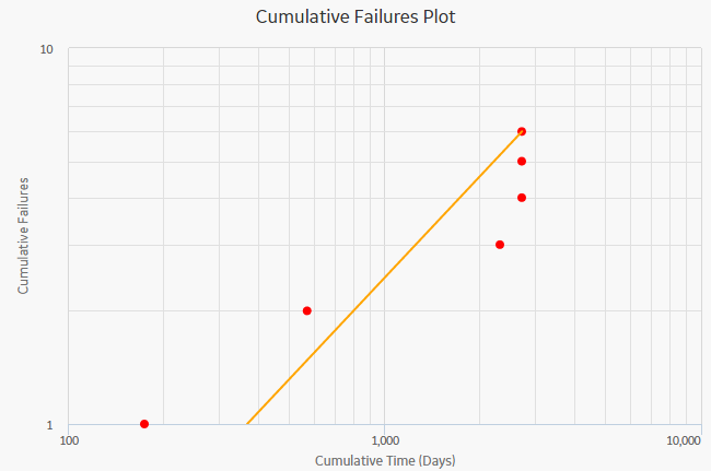
The Cumulative <Measurement> Plot is a log-log graph with data overlay. The graph uses logarithmic scales on both the horizontal and vertical axes. The graph represents the cumulative <Measurement> as a function of the cumulative time (Cumulative Failures vs. Cumulative Operating Time), which is the total amount of time the Asset has been in operation since the start of the analysis.
The following image displays the Cumulative Failures Plot:

Graph Features
While viewing the graph, you can:
-
Hover on any datapoint to view the coordinates and the details of a datapoint.
Note: This feature may not be available on all the devices based on the screen resolution. On tablets and smaller devices, you can select the datapoint to view the details of an observed datapoint.- For an observed datapoint, you can access the name of the asset, date of the observation, cumulative time in the analysis at the specified time, and number of cumulative <measurements> till the specified date.
-
For a datapoint on the estimated data line, you can access the name of the segment, cumulative time at the selected point on the line, number of cumulative <measurements> at the selected point on the line, value of beta and lambda, and determine whether the analysis passed the GOF test or not.
You can also determine whether the analysis passed the GOF test by the color of the plot line. If the graph line is blue, it passed the GOF test. If the plot line is orange, it failed the GOF test.
-
Select an observed datapoint to open Point Tooltip window and view the data.
On the Point Tooltip window, you can:
- Access the name of the asset, date of the observation, cumulative time in the analysis at the specified time, and number of cumulative <measurements> till the specified date.
-
Select Split to Split the analysis into segments.
Note: If you have already split the data, Split will be replaced with Merge. You can select Merge to merge the segments again. - Select Go to Editor to access the Reliability Growth Data window, where you can modify the datapoint details.
- Customize the appearance of the graph by using standard graph features.
- Estimate how many failures will have occurred at some date in the future.
MTB <Measurement> Trend
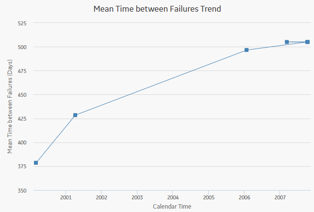
The Mean Time between <Measurement> Trend graph displays how the mean time between <Measurement> changes over time. The mean time between <Measurement> is calculated from the distribution of the <Measurement> over time. The datapoints represent observed failure dates included in the analysis. The Mean Time between <Measurement> Trend graph displays:
- How mean time between <Measurement> has decreased or increased over time.
- Whether the strategy changes have improved mean time between <Measurement> or not.
The following image displays a Mean Time Between Failures Trend graph:

Graph Features
While viewing the graph, you can:
-
Hover on any datapoint to access the coordinates and the details of a datapoint. You can access the number of cumulative <measurements> on the specified date, date of the observation, and mean time between <measurements> at the specified time.
Note: This feature may not be available on all the devices. On tablets and smaller devices, you can select on the datapoint to view the details of an observed datapoint. -
Select an observed datapoint to display the Point Tooltip window and access the data.
On the Point Tooltip window, you can:
- Access the number of cumulative <measurements> on the specified date, date of the observation, and mean time between <measurements> at the specified time.
-
Select the Split to Split the analysis into segments.
Note: If you have already split the data, the Split will be replaced with Merge. You can select Merge to merge the segments again. - Select the Go to Editor to display the Reliability Growth Data window, where you can modify the data.
- Customize the appearance of the graph by using standard graph features.
- Estimate how many <measurements> will have occurred (and what the MTB<measurement> would be) at some date in the future.
<Measurement> Rate Trend
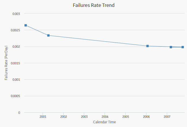
The <Measurement> Rate Trend graph displays the <Measurement> rate of a piece of equipment or location changes over time. This graph is the inverse of the Measurement Time between <Measurement> Trend graph. The datapoints represent observed <Measurement> dates included in the analysis. You can use the <Measurement> Rate Trend graph to view changes in the rate that <measurements> are occurring. You can also view the number of <measurements> occurring per day, rather than the number of days between <measurements>.
The following image displays a Failures Rate Trend graph:

Graph Features
While viewing the graph, you can:
-
Hover on any datapoint to view the coordinates and the details of a datapoint. You can view the number of cumulative <measurements> on the specified date, date of the observation, and <measurement> rate at the specified time.
Note: This feature may not be available on all devices. On tablets and smaller devices, you can tap on the datapoint to view the details of an observed datapoint. -
Select an observed datapoint to display the Point Tooltip window and view the data.
On the Point Tooltip window, you can:
- View number of cumulative <measurements> on the specified date, date of the observation, and <measurement> rate at the specified time.
-
Select Split to Split the analysis into segments.
Note: If you have already split the data, Split will be replaced with Merge. You can select Merge to merge the segments again. - Select the Go to Editor to access the Reliability Growth Data window, where you can modify the data.
- Customize the appearance of the graph by using standard graph features.
- Estimate how many <measurements> will have occurred at some date in the future.
AMSAA Detailed Results (Event-Based)
The AMSAA Reliability Growth Model section displays the results of the Reliability Growth Analysis calculations. If the Reliability Growth Analysis has been split into multiple segments, a separate set of results will be displayed for each segment. The labels on the AMSAA Reliability Growth Model section will look different depending on whether or not the analysis contains event-based data. If the data is event-based, certain labels will also look different depending on whether or not the data contains dates.
The AMSAA Reliability Growth Model section displays the following information:
- Initial Mean time Between <Measurement>: Contains the mean time between <Measurement> that was calculated at the beginning of the analysis, or the beginning of the segment.
- Final Mean Time Between <Measurement>: Contains the mean time between <Measurement> that was calculated at the end of the analysis, or end of the segment.
Additionally, for analyses based on event-based data that do not include dates, references to dates will be displayed as the units you chose for your analysis (e.g., At 303,156.00 Miles, the MTBF is 20,757.81 Miles).

AMSAA Detailed Results (Non-Event)
The AMSAA Reliability Growth Model section displays the results of the Reliability Growth Analysis calculations. If the Reliability Growth Analysis has been split into multiple segments, a separate set of results will be displayed for each segment.
The AMSAA Reliability Growth Model section for an analysis based upon non-event data will look mostly the same as the AMSAA Reliability Growth Model section for an event-based analysis. Instead of showing the Initial Mean time Between <Measurement> and Final Mean time Between <Measurement>, however, the following items will be displayed:
- Initial <Measurement> Rate: Contains the <Measurement> rate, calculated from when the first datapoint is recorded for the segment.
- Final <Measurement> Rate: Contains the <Measurement> rate at the end of the segment.
Additionally, for an analysis that is based on data that includes cumulative operating time and does not include dates, references to dates will be displayed as the units you chose for your analysis (e.g., At 62 Months, the Cost Rate is 83.7040 Per Month).
About Interpreting Extrapolation Results
After you select an extrapolation method (by date or by amount of time), for each segment in the analysis, a dotted green line extends from the last failure date for that segment to the specified date in the future. The future date is calculated based on the date or time units you provided in the Select Extrapolation window. At the end of the dotted green line, a number appears, representing the estimated number of failures that would have occurred at that point in time.
A solid green line also intersects the end date for each segment, and the cumulative operating time at the end of that segment appears on the solid green line.