Production Line is a way to study or assess the results of a Production Analysis. When you view the results of a Production Analysis, you can define the following types of lines:
The Production Lines pane contains rows representing Production lines created on the Production Data plot. The color and background of each row corresponds to the color of the line on the analysis. Optionally, within the Production Lines pane, you can choose any line color from the color palette that appears when you select the color palette in the Color column.
For each row, the Production Lines section provides following columns of information:
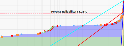
Beta: Contains the Beta value for the line. In a Production Analysis, the Beta value indicates how reliable the production process is. The closer the line is to vertical, the higher the Beta value. A higher Beta value indicates less variation in the production process (more reliable); a lower Beta value indicates more variation in the production process (less reliable). You can use the following general guidelines to evaluate the production process according to the Beta value.
You can manually change the Beta and Eta values for the selected line by selecting any Beta and Eta value field from the Production Lines list, deleting the current value, and defining a different one.
Somewhere on the Production Analysis, you should be able to identify a group of datapoints that represent your typical output. This output is represented by a Demonstrated Line. The Demonstrated Line extends beyond the plotted datapoint to show what the production would have been if the production rate had not started to drop off due to reliability problems, such as Asset failures, cutbacks, and downtime. Drawing the Demonstrated Line first can help you determine where to draw the Process Reliability Line. You will want to draw the Process Reliability Line where the datapoints begin to deviate from the Demonstrated Line.
The following image shows an example of a Demonstrated Line:
An ideal process will produce the maximum possible output at all times, but actual processes demonstrate variation in output over time. The variation in output can be caused by various factors, including process problems, Asset problems, shutdowns, and cutbacks.
The Process Reliability Line marks the location at which datapoints begin to trend away from the Demonstrated Line. This is the location at which variation in output shifts from being attributed to production losses to being attributed to reliability losses. It defines the reliability of the process, expressed as a percentage. It is the point at which the process shifts from being fairly reliable to being unreliable.
The decision of where to draw the Process Reliability Line is somewhat subjective and will be determined by how your datapoints look after they have been plotted and how you interpret the plot. If your datapoints do not exhibit a distinct trend away from the Demonstrated Line, and are plotted in a fairly straight, diagonal line, it may not be appropriate to draw the Process Reliability Line at all.
The following image shows an example of a Process Reliability line showing that reliability of the process is 53.28%:
Every process will have both ideal output value and actual output values. Ideally, a process should always produce the maximum possible output. The maximum possible output is determined by a variety of factors and is often influenced most significantly by manufacturer specifications. Many manufacturers specify a nameplate value for their equipment to indicate the highest capacity of a given piece of equipment under ideal operating conditions. Together, the nameplate values for the individual pieces of equipment can help you determine the nameplate value for the entire unit, which is the maximum production output for the process under ideal operating conditions.
After you have plotted your production data, you will want to draw a Nameplate Line on the Production Analysis Plot to indicate the ideal output. GE Digital APM will calculate the difference between the ideal output and your observed output values (represented by the Demonstrated Line) to determine your Efficiency/Utilization Losses.
It may not always be appropriate to use the manufacturer's nameplate value as the nameplate value for your process. The maximum production capacity based on manufacturers' specifications may be unrealistic if you intentionally operate under conditions that do not meet those specifications. For example, you may operate at a lower temperature due to environmental constraints. If you calculate your production losses based on an impossible goal, your losses may appear inflated. In this case, you may want to take these factors into account to determine a more realistic nameplate value: one that actually can be achieved.
The following image shows an example of a Nameplate Line:
After you have drawn the Demonstrated Line, the Process Reliability Line, and the Nameplate Line, you can optionally draw one or more additional Custom Lines to compare historical or projected production rates to the observed production rate. For example, you might draw a Custom Line:
The following image shows a Custom line drawn using a Beta value of 10 and Eta value of 1:
Copyright © 2018 General Electric Company. All rights reserved.