When you choose a column or field to be plotted on the y-axis, you must specify the side of the graph on which the axis will appear: left or right. You can do so using the options that are available in the Dimension Mapping workspace.
If you choose to plot more than one column or field on the y-axis and the values in those columns or fields vary greatly, using a right and left y-axis can improve the usability of the graph.
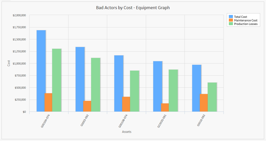
Suppose you have a graph with the following underlying data:
| Equipment Technical Number | Total Cost | Maintenance Cost | Production Losses |
|---|---|---|---|
| G0010A-074 | 1690651 | 386387 | 1304264 |
| G0003-092 | 1341803 | 228380 | 1113423 |
| G0010B-074 | 1166331 | 312371 | 853960 |
| GC0030-091 | 1046865 | 175728 | 871137 |
| G0016-092 | 975146 | 369122 | 606024 |
In this example, if we plot a graph with multiple vertical axis values, it allows you to compare total cost, maintenance cost, and production loss, which provides a fuller picture of your assets.
Copyright © 2018 General Electric Company. All rights reserved.